
How to Create Treemap Visualizations in Python to Display Topic Distribution
Quick Answer: This tutorial teaches you how to create professional treemap visualizations in Python using Squarify and real news data from the NewsDataHub API. You’ll learn to visualize topic distributions with space-efficient, colorful treemaps that make patterns instantly visible.
Perfect for: Python developers, data analysts, students, and anyone building news analytics dashboards or data visualization projects.
Time to complete: 15-20 minutes
Difficulty: Beginner
Stack: Python, Matplotlib, Squarify, NewsDataHub API
What You’ll Build
Section titled “What You’ll Build”You’ll create a professional treemap visualization to analyze news data:
- Topic distribution treemap — See which topics dominate your news dataset with proportional rectangles
- Space-efficient visualization — Display 20+ categories in a single, readable chart
- Publication-ready output — Export high-resolution images for reports and presentations
By the end, you’ll know when to use treemaps vs. bar charts or pie charts for categorical data.
Prerequisites
Section titled “Prerequisites”Required Tools
Section titled “Required Tools”- Python 3.7+
- pip package manager
Install Required Packages
Section titled “Install Required Packages”pip install requests matplotlib squarifyAPI Key (Optional)
Section titled “API Key (Optional)”You don’t need an API key to complete this tutorial. The code automatically downloads sample data from GitHub if no key is provided, so you can follow along and build all the charts right away.
If you want to fetch live data instead, grab a free key at newsdatahub.com/login. Note that some fields used in this tutorial (topics, keywords, source metadata) require a paid plan - the sample data includes these fields so you can explore the full analysis regardless.
For current API quotas and rate limits, visit newsdatahub.com/plans.
Knowledge Prerequisites
Section titled “Knowledge Prerequisites”- Basic Python syntax
- Familiarity with lists and dictionaries
- Understanding of loops and functions
Understanding Treemaps: When and Why to Use Them
Section titled “Understanding Treemaps: When and Why to Use Them”What Are Treemaps?
Section titled “What Are Treemaps?”A treemap is a visualization that displays hierarchical data using nested rectangles. Each rectangle’s area is proportional to the value it represents. Unlike bar charts that show data linearly, treemaps maximize space efficiency by filling the entire canvas with data.
Key characteristics:
- Area-based encoding — Rectangle size directly corresponds to value magnitude
- Space-efficient — No wasted space between categories
- Pattern recognition — Dominant categories become immediately obvious through visual weight
- Hierarchical capability — Can show multiple levels of categorization simultaneously
When to Use Treemaps vs. Other Charts
Section titled “When to Use Treemaps vs. Other Charts”Use treemaps when:
- You have many categories (10-30+) to compare
- You want to show parts of a whole and their relative proportions
- Space efficiency is important (displaying many categories in limited space)
- You need to make dominant patterns immediately visible
- Categories have significantly different magnitudes
Use bar charts when:
- You have fewer categories (3-10)
- Precise value comparison is critical
- You’re showing rankings or ordered data
- Exact numerical differences matter more than proportions
Use pie charts when:
- You have very few categories (2-5)
- You need to show simple percentage breakdown
- Total equals 100% (pie charts are not suitable when parts don’t sum to a whole)
For a comprehensive guide on bar charts, see How to Create Bar Charts in Python Using Real News Data.
How to Interpret Treemaps
Section titled “How to Interpret Treemaps”When reading a treemap:
- Larger rectangles = higher values — The biggest rectangle represents the category with the most items
- Compare areas, not dimensions — A rectangle with twice the area represents twice the quantity
- Color encodes categories — Each color represents a distinct category or theme
- Layout optimizes space — Rectangles are arranged algorithmically to minimize wasted space
Real-World Use Cases
Section titled “Real-World Use Cases”Treemaps excel in scenarios like:
- News topic analysis — Visualize which topics dominate media coverage
- Market share visualization — Show company market shares in an industry
- Disk space usage — Display file system storage consumption
- Budget allocation — Represent spending across departments
- Website analytics — Show page views across different sections
Step 1: Fetch News Data
Section titled “Step 1: Fetch News Data”We’ll retrieve news articles to analyze. You have two options:
With an API key: The script fetches live data from NewsDataHub, using cursor-based pagination to retrieve multiple pages.
Without an API key: The script downloads a sample dataset from GitHub, so you can follow along without signing up.
Fetching Articles
Section titled “Fetching Articles”import requestsimport matplotlib.pyplot as pltimport squarifyfrom collections import Counterimport jsonimport os
# Set your API key here (or leave empty to use sample data)API_KEY = "" # Replace with your NewsDataHub API key, or leave empty
# Check if API key is providedif API_KEY and API_KEY != "your_api_key_here": print("Using live API data...")
url = "https://api.newsdatahub.com/v1/news" headers = { "x-api-key": API_KEY, "User-Agent": "treemap-visualization-topic-distribution-with-newsdatahub/1.0-py" }
# Fetch 100 articles params = {"per_page": 100}
response = requests.get(url, headers=headers, params=params) response.raise_for_status() data = response.json()
articles = data.get("data", []) print(f"Fetched {len(articles)} articles from API")
else: print("No API key provided. Loading sample data...")
# Download sample data if not already present sample_file = "sample-news-data.json"
if not os.path.exists(sample_file): print("Downloading sample data...") sample_url = "https://raw.githubusercontent.com/newsdatahub/newsdatahub-data-science-tutorials/main/tutorials/bar-charts-news-data/data/sample-news-data.json" response = requests.get(sample_url) with open(sample_file, "w") as f: json.dump(response.json(), f) print(f"Sample data saved to {sample_file}")
# Load sample data with open(sample_file, "r") as f: data = json.load(f)
# Handle both formats: raw array or API response with 'data' key if isinstance(data, dict) and "data" in data: articles = data["data"] elif isinstance(data, list): articles = data else: raise ValueError("Unexpected sample data format")
print(f"Loaded {len(articles)} articles from sample data")Expected output (with API key):
Using live API data...Fetched 100 articles from APIExpected output (without API key):
No API key provided. Loading sample data...Downloading sample data...Sample data saved to sample-news-data.jsonLoaded 100 articles from sample dataUnderstanding the Code
Section titled “Understanding the Code”API_KEY - Set to your NewsDataHub API key for live data, or leave empty to use sample data
When API_KEY is provided:
x-api-keyheader — Authenticates your request (replace with your actual key)per_pageparameter — Controls how many articles to fetch (max 100 on free tier)raise_for_status()— Throws an error for 4XX/5XX HTTP responsesdata.get("data", [])— Safely extracts the articles array from the response
When API_KEY is empty, the else block runs:
os.path.exists()— Checks if sample data was already downloaded to avoid redundant requests- Downloads from GitHub — Fetches a curated sample dataset with 100 articles including topic metadata
json.dump()— Saves the sample data locally for reuse across multiple runs- Format handling — Uses
isinstance()to handle both raw arrays and API response objects ValueError— Raises clear error if data format is unexpected
Why this dual-mode pattern?
- Lower barrier to entry — You can complete the tutorial without signing up or using API quota
- Faster iteration — Sample data loads instantly vs. waiting for API calls
- Consistent learning experience — Sample data includes all fields (topics, source metadata) regardless of API tier
Step 2: Extract and Aggregate Topic Data
Section titled “Step 2: Extract and Aggregate Topic Data”NewsDataHub returns topics as an array because articles often cover multiple subjects. For treemap visualization, we need to count how many articles mention each topic.
Extract Topics from Articles
Section titled “Extract Topics from Articles”# ============================================================================# Extract and Count Topics# ============================================================================# Extract topics - NewsDataHub returns 'topics' as an arraytopics = []for article in articles: article_topics = article.get("topics", []) if article_topics: # If topics is a list, extend our topics list if isinstance(article_topics, list): topics.extend(article_topics) else: topics.append(article_topics)
print(f"\nTotal topic mentions: {len(topics)}")
# Exclude 'general' topic (articles not yet categorized)topics = [t for t in topics if t != 'general']
# Count topic occurrencestopic_counts = Counter(topics)print(f"Found {len(topic_counts)} unique topics (excluding 'general')")
# Get top 20 topics for visualizationtop_topics = dict(topic_counts.most_common(20))print(f"Displaying top 20 topics out of {len(topic_counts)} total")What this does:
- NewsDataHub returns
topicsas an array, not a single value - Each article can have multiple topics (e.g., an AI startup funding story might be tagged as both “technology” and “business”)
- We use
extend()to add all topics from each article to our list - Excluding ‘general’ topic — The ‘general’ topic is applied to articles not yet categorized. Filtering it out ensures we only visualize meaningful content categories
Counterefficiently aggregates and counts topic occurrences- Limiting to top 20 topics — Prevents clutter from rare topics with only 1-2 mentions, making the treemap readable
Why 20 topics?
- Treemaps can handle many categories, but beyond 20-30, smaller rectangles become too small to label clearly
- Top 20 captures the dominant patterns while maintaining readability
- You can adjust this number based on your data distribution
Step 3: Create a Professional Treemap Visualization
Section titled “Step 3: Create a Professional Treemap Visualization”Now you’ll transform the aggregated topic counts into a beautiful, space-efficient treemap.
Prepare Data for Plotting
Section titled “Prepare Data for Plotting”# Prepare data for plottinglabels = list(top_topics.keys())sizes = list(top_topics.values())
print(f"Ready to visualize {len(labels)} topics")Create the Treemap
Section titled “Create the Treemap”# ============================================================================# Create Treemap Visualization# ============================================================================# Prepare data for plottinglabels = list(top_topics.keys())sizes = list(top_topics.values())
# Vibrant color palette for visual distinctioncolors = [ '#EF4444', # Red '#3B82F6', # Blue '#10B981', # Green '#FBBF24', # Yellow '#8B5CF6', # Purple '#F59E0B', # Orange '#EC4899', # Pink '#14B8A6', # Teal '#6366F1', # Indigo '#F97316', # Orange-red '#FF6B6B', # Light red '#4ECDC4', # Cyan '#45B7D1', # Sky blue '#FFA07A', # Light salmon '#98D8C8', # Mint '#F7DC6F', # Light yellow '#BB8FCE', # Lavender '#85C1E2', # Baby blue '#52B788', # Forest green '#34D399' # Emerald]
# Create figure with appropriate sizeplt.figure(figsize=(16, 10))
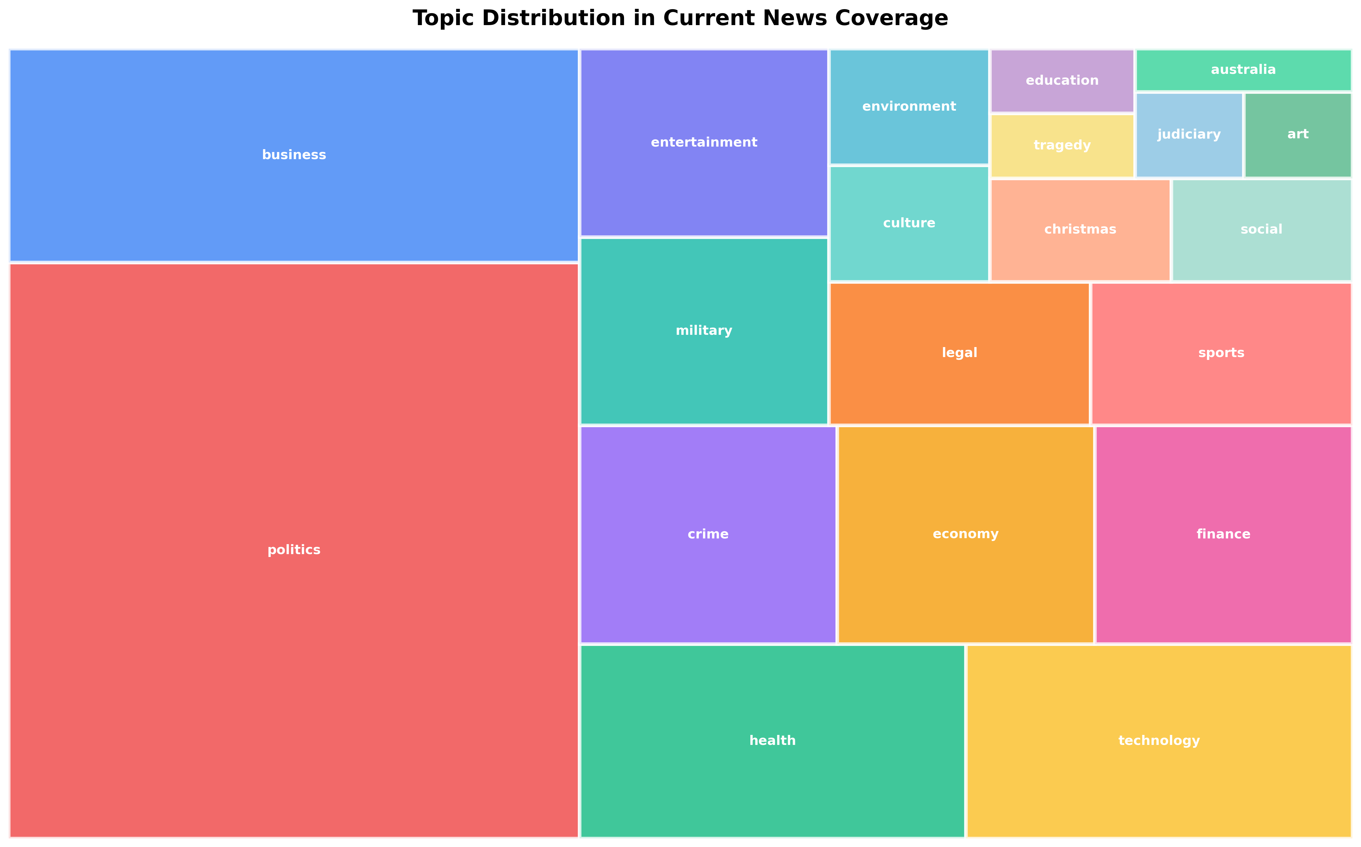
# Create treemap using squarifysquarify.plot( sizes=sizes, label=labels, color=colors[:len(labels)], text_kwargs={'fontsize': 11, 'weight': 'bold', 'color': 'white'}, bar_kwargs={'edgecolor': 'white', 'linewidth': 3, 'alpha': 0.8})
# Style the chartplt.title('Topic Distribution in Current News Coverage', fontsize=18, fontweight='bold', pad=20)plt.axis('off') # Remove axes for cleaner look
plt.tight_layout()plt.savefig('topic-distribution-treemap.png', dpi=300, bbox_inches='tight')print("\n✓ Treemap visualization saved: topic-distribution-treemap.png")Styling breakdown:
Figure Size:
figsize=(16, 10)— Large canvas provides ample space for 20 rectangles and labels- Wide aspect ratio (16:10) works well for treemaps, balancing horizontal and vertical divisions
Color Selection:
- Vibrant palette with 20 distinct colors — Each topic gets a unique, easily distinguishable color
- High saturation — Makes categories stand out and creates visual impact
- Colors chosen for maximum distinction — Adjacent rectangles have contrasting colors
Typography:
fontsize=11— Balances readability with space constraintsweight='bold'— Makes text stand out against colored backgroundscolor='white'— Ensures text is visible on all background colors- Automatic text placement — Squarify library handles optimal label positioning
Visual Enhancements:
bar_kwargs={'alpha': 0.8}— Subtle transparency adds visual depth without compromising readabilitybar_kwargs={'edgecolor': 'white', 'linewidth': 3}— Thick white borders create clear separation between categoriesaxis('off')— Removes unnecessary chart elements (x-axis, y-axis) for a clean, minimal design
Output Quality:
dpi=300— High resolution for publication-quality images (suitable for reports, presentations, print)bbox_inches='tight'— Removes excess whitespace around the visualization
Step 4: Enhance with Value Labels
Section titled “Step 4: Enhance with Value Labels”For better context, you can include article counts alongside topic names in the labels.
Custom Labels with Counts
Section titled “Custom Labels with Counts”# ============================================================================# Create Enhanced Treemap with Value Labels# ============================================================================# Create labels with topic names and countslabels_with_counts = [f"{topic}\n({count})" for topic, count in top_topics.items()]
plt.figure(figsize=(16, 10))
squarify.plot( sizes=sizes, label=labels_with_counts, color=colors[:len(labels)], text_kwargs={'fontsize': 10, 'weight': 'bold', 'color': 'white'}, bar_kwargs={'edgecolor': 'white', 'linewidth': 3, 'alpha': 0.8})
plt.title('Topic Distribution in Current News Coverage (with counts)', fontsize=18, fontweight='bold', pad=20)plt.axis('off')
plt.tight_layout()plt.savefig('topic-distribution-treemap-with-counts.png', dpi=300, bbox_inches='tight')print("✓ Enhanced treemap with counts saved: topic-distribution-treemap-with-counts.png")Why include counts?
- Provides exact values — Viewers can see precise article counts, not just relative proportions
- Enhances interpretability — Combines visual (area) and numerical (count) information
- Aids decision-making — Exact numbers support data-driven conclusions
Label formatting:
\nseparator — Places count on a new line for better readability- Parentheses — Visually distinguishes the count from the topic name
- Reduced font size —
fontsize=10accommodates longer labels
Working Within API Rate Limits
Section titled “Working Within API Rate Limits”NewsDataHub free tier offers 100 API calls per day. Here’s how to maximize your usage:
Cache Data During Development
Section titled “Cache Data During Development”import json
# Save fetched data to diskwith open("cached_news.json", "w") as f: json.dump(articles, f, indent=2)
# Load from cache instead of making API callswith open("cached_news.json", "r") as f: articles = json.load(f)Benefits:
- Iterate faster — No waiting for API responses during chart tweaking
- Preserve quota — Save API calls for fresh data collection
- Reproducibility — Analyze the same dataset across sessions
- Experiment freely — Try different visualization parameters without using API calls
Plan Your Data Collection
Section titled “Plan Your Data Collection”- Daily topic tracking — Fetch 100 articles daily to monitor topic trends over time
- Weekly deep dives — Accumulate data over a week for larger sample sizes
- Upgrade when needed — Visit newsdatahub.com/plans for higher limits
Best Practices for Professional Treemaps
Section titled “Best Practices for Professional Treemaps”1. Choose Distinct, Vibrant Colors
Section titled “1. Choose Distinct, Vibrant Colors”Use high-contrast colors that are easy to distinguish:
# Professional color palettecolors = [ '#EF4444', '#3B82F6', '#10B981', '#FBBF24', '#8B5CF6', '#F59E0B', '#EC4899', '#14B8A6', '#6366F1', '#F97316']Color palette resources:
- ColorBrewer for data viz: colorbrewer2.org
- Tailwind CSS colors — Modern, accessible palette
- Brand colors if building for a specific organization
2. Limit Categories for Readability
Section titled “2. Limit Categories for Readability”# Limit to top N categoriestop_topics = dict(topic_counts.most_common(20)) # Sweet spot: 15-25 categories
# Or filter by minimum thresholdtop_topics = {topic: count for topic, count in topic_counts.items() if count >= 3}Why limit categories?
- Too many small rectangles become unreadable (text won’t fit)
- Aim for 15-30 categories maximum
- Group rare categories into “Other” if needed
3. Ensure Text Readability
Section titled “3. Ensure Text Readability”# Use white text on colored backgroundstext_kwargs={'fontsize': 11, 'weight': 'bold', 'color': 'white'}
# Add thick white borders for separationbar_kwargs={'edgecolor': 'white', 'linewidth': 3}Readability tips:
- White text works on most vibrant backgrounds
- Bold weight improves legibility at small sizes
- Borders prevent visual bleeding between adjacent rectangles
4. Optimize Figure Size
Section titled “4. Optimize Figure Size”# Large canvas for many categoriesplt.figure(figsize=(16, 10)) # For 20+ categories
# Smaller canvas for fewer categoriesplt.figure(figsize=(12, 8)) # For 10-15 categories5. Add Descriptive Titles
Section titled “5. Add Descriptive Titles”plt.title('Topic Distribution in Current News Coverage', fontsize=18, fontweight='bold', pad=20)Title best practices:
- Clearly describe what the visualization shows
- Include time context if relevant (“Current”, “Weekly”, “November 2025”)
- Use sentence case for readability
- Add padding for visual separation from the chart
Extending This Tutorial
Section titled “Extending This Tutorial”Once you’re comfortable with basic treemaps, try these enhancements:
1. Filter by Country or Source
Section titled “1. Filter by Country or Source”Analyze regional differences in topic coverage:
# Filter for US news onlyparams = {"per_page": 100, "country": "US"}
# Filter by specific sourcesparams = {"per_page": 100, "source": "bbc-news,cnn"}
2. Compare Multiple Treemaps
Section titled “2. Compare Multiple Treemaps”Create side-by-side comparisons:
fig, (ax1, ax2) = plt.subplots(1, 2, figsize=(20, 10))
# US news topicsplt.sca(ax1)squarify.plot(sizes=us_sizes, label=us_labels, ...)ax1.set_title('US News Topics')
# UK news topicsplt.sca(ax2)squarify.plot(sizes=uk_sizes, label=uk_labels, ...)ax2.set_title('UK News Topics')
3. Time Series Analysis
Section titled “3. Time Series Analysis”Track how topic distribution changes over time:
# Fetch data for multiple days# Create separate treemaps for each day# Compare to identify trending topics4. Interactive Treemaps with Plotly
Section titled “4. Interactive Treemaps with Plotly”For web dashboards, use Plotly for hover effects:
import plotly.express as px
fig = px.treemap(    names=labels,    parents=[""] * len(labels),  # Flat hierarchy    values=sizes,    title='Topic Distribution')fig.show()
5. Hierarchical Treemaps
Section titled “5. Hierarchical Treemaps”Group topics into broader categories:
# Group topics into parent categoriescategories = {    'Politics': ['politics', 'world', 'government'],    'Technology': ['technology', 'science', 'ai'],    'Entertainment': ['entertainment', 'sports', 'lifestyle']}
# Create hierarchical structure for plotting- When should I use a treemap instead of a bar chart?
Use treemaps when you have 10+ categories and want to show proportions visually. Treemaps are more space-efficient and make dominant patterns immediately obvious. Use bar charts when you have fewer categories (3-10) or need precise value comparisons.
- How many categories can a treemap handle?
Treemaps can theoretically handle unlimited categories, but practically limit to 20-30 for readability. Beyond this, smaller rectangles become too small to label clearly. Consider grouping rare categories into “Other”.
- Can treemaps show hierarchical data?
Yes! Treemaps excel at hierarchical data. However, the squarify library only supports flat (non-hierarchical) layouts. For hierarchical treemaps with nested rectangles showing parent-child relationships, use Plotly’s px.treemap() which has built-in support for hierarchical data via the parents parameter.
- Why use squarify instead of matplotlib’s built-in treemap?
Matplotlib doesn’t have a built-in treemap function. Squarify is the standard Python library for treemaps, using the squarified treemap algorithm which creates more readable layouts than simple rectangular subdivision.
- How does the squarified algorithm work?
The squarified algorithm arranges rectangles to minimize their aspect ratios (closeness to squares). Squares are easier to compare visually than elongated rectangles, improving readability.
- Can I customize the layout algorithm?
Squarify uses the squarified algorithm by default. For alternative layouts, explore libraries like plotly (which offers different tiling methods) or implement custom algorithms.
- How do I handle negative values in treemaps?
Treemaps cannot display negative values (area cannot be negative). If your data includes negative values, either filter them out, use absolute values, or choose a different chart type like bar charts.
- What if my API key doesn’t work?
Verify:
- Key is correct (check your dashboard)
- Header name is
x-api-key(lowercase, with hyphens) - You haven’t exceeded rate limits
- Network/firewall isn’t blocking API requests
- How do I filter for specific topics or countries?
Add parameters to your API request:
params = { "per_page": 100, "topic": "technology", "country": "US"}See NewsDataHub Search & Filtering Guide for all available filters.
- Can I fetch more than 100 articles on the free tier?
Yes, using pagination. Each API call is limited to 100 results, but you can make multiple calls (up to your daily limit) using cursor-based pagination. See How Does Cursor Pagination Work in NewsDataHub API for details.