
How to Create Bar Charts in Python Using Real News Data
Quick Answer: This tutorial teaches you how to create professional bar charts in Python using Matplotlib and real news data from the NewsDataHub API. You’ll learn to visualize topic distributions, language breakdowns, and top news sources with clean, readable charts.
Perfect for: Python developers, data analysts, students, and anyone building news analytics dashboards or data visualization projects.
Time to complete: 15-20 minutes
Difficulty: Beginner
Stack: Python, Matplotlib, NewsDataHub API
What You’ll Build
Section titled “What You’ll Build”You’ll create three types of bar charts to analyze news data:
- Topic distribution chart — See which topics dominate your news dataset
- Language distribution chart — Analyze article distribution across languages using horizontal bars
- Top 10 sources chart — Identify the most active news publishers
- Optional: Political leaning analysis — Understand bias distribution across coverage
By the end, you’ll understand when to use bar charts vs. other chart types for categorical data.
Prerequisites
Section titled “Prerequisites”Required Tools
Section titled “Required Tools”- Python 3.7+
- pip package manager
Install Required Packages
Section titled “Install Required Packages”pip install requests matplotlibAPI Key (Optional)
Section titled “API Key (Optional)”You don’t need an API key to complete this tutorial. The code automatically downloads sample data from GitHub if no key is provided, so you can follow along and build all the charts right away.
If you want to fetch live data instead, grab a free key at newsdatahub.com/login. Note that some fields used in this tutorial (topics, keywords, source metadata) require a paid plan - the sample data includes these fields so you can explore the full analysis regardless.
For current API quotas and rate limits, visit newsdatahub.com/plans.
Knowledge Prerequisites
Section titled “Knowledge Prerequisites”- Basic Python syntax
- Familiarity with lists and dictionaries
- Understanding of loops and functions
Step 1: Fetch News Data
Section titled “Step 1: Fetch News Data”We’ll retrieve news articles to analyze. You have two options:
With an API key: The script fetches live data from NewsDataHub, using cursor-based pagination to retrieve multiple pages (up to 200 articles).
Without an API key: The script downloads a sample dataset from GitHub, so you can follow along without signing up.
Fetching Articles
Section titled “Fetching Articles”import requestsimport matplotlib.pyplot as pltfrom collections import Counterimport jsonimport os
# Set your API key here (or leave empty to use sample data)API_KEY = "" # Replace with your NewsDataHub API key, or leave empty
# Check if API key is providedif API_KEY and API_KEY != "your_api_key_here": print("Using live API data...")
url = "https://api.newsdatahub.com/v1/news" headers = { "x-api-key": API_KEY, "User-Agent": "bar-charts-in-python-using-real-news-data/1.0-py" }
articles = [] cursor = None
# Fetch 2 pages (up to 200 articles) for _ in range(2): params = { "per_page": 100, "country": "US,FR,DE,ES,BR", "source_type": "mainstream_news,digital_native" } if cursor: params["cursor"] = cursor
response = requests.get(url, headers=headers, params=params) response.raise_for_status() data = response.json()
articles.extend(data.get("data", [])) cursor = data.get("next_cursor")
if not cursor: break
print(f"Fetched {len(articles)} articles from API")
else: print("No API key provided. Loading sample data...")
# Download sample data if not already present sample_file = "sample-news-data.json"
if not os.path.exists(sample_file): print("Downloading sample data...") sample_url = "https://raw.githubusercontent.com/newsdatahub/newsdatahub-data-science-tutorials/main/tutorials/bar-charts-news-data/data/sample-news-data.json" response = requests.get(sample_url) with open(sample_file, "w") as f: json.dump(response.json(), f) print(f"Sample data saved to {sample_file}")
# Load sample data with open(sample_file, "r") as f: data = json.load(f)
# Handle both formats: raw array or API response with 'data' key if isinstance(data, dict) and "data" in data: articles = data["data"] elif isinstance(data, list): articles = data else: raise ValueError("Unexpected sample data format")
print(f"Loaded {len(articles)} articles from sample data")Expected output:
Using live API data...Fetched 200 articles from APIor if running without the API key:
No API key provided. Loading sample data...Downloading sample data...Sample data saved to sample-news-data.jsonLoaded 100 articles from sample dataUnderstanding the Code
Section titled “Understanding the Code”API_KEY - Set to your NewsDataHub API key for live data, or leave empty to use sample data
When API_KEY is provided:
x-api-keyheader — Authenticates your request (replace with your actual key)per_pageparameter — Controls batch size (max 100 on free tier)countryparameter — Fetches from multiple countries (US, France, Germany, Spain, Brazil) to get diverse languages and topicssource_typeparameter — Filters for mainstream and digital-native sources for quality contentcursorparameter — Marks your position in the result set for the next pagenext_cursor— Returned in the response; use it for the next requestraise_for_status()— Throws an error for 4XX/5XX HTTP responses
When API_KEY is empty, the else block runs: it downloads sample data from GitHub (or loads it locally if already downloaded), giving you the same dataset structure without needing API access
Why multi-country filtering?
- Creates meaningful language distribution — You’ll see English, French, German, Spanish, and Portuguese
- Demonstrates global news coverage — Shows NewsDataHub’s international reach
- Produces diverse topic data — Different countries cover different stories
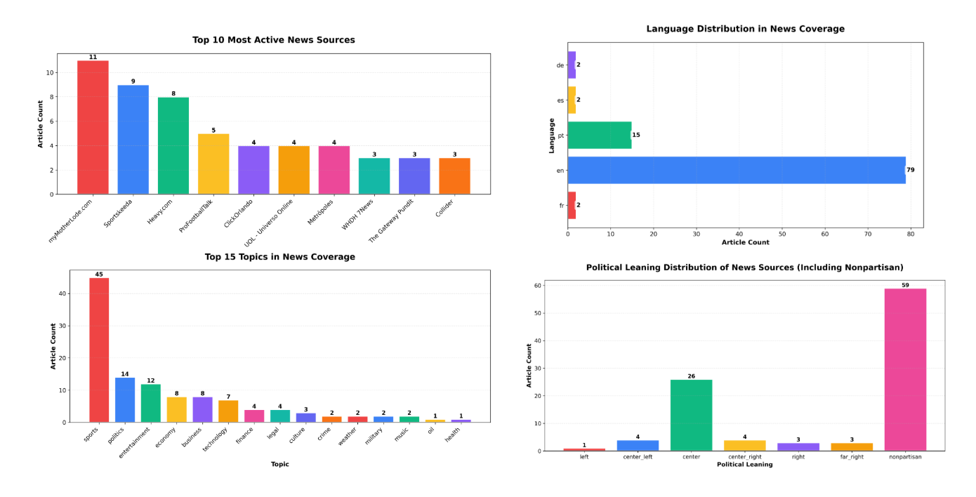
Step 2: Visualize Topic Distribution
Section titled “Step 2: Visualize Topic Distribution”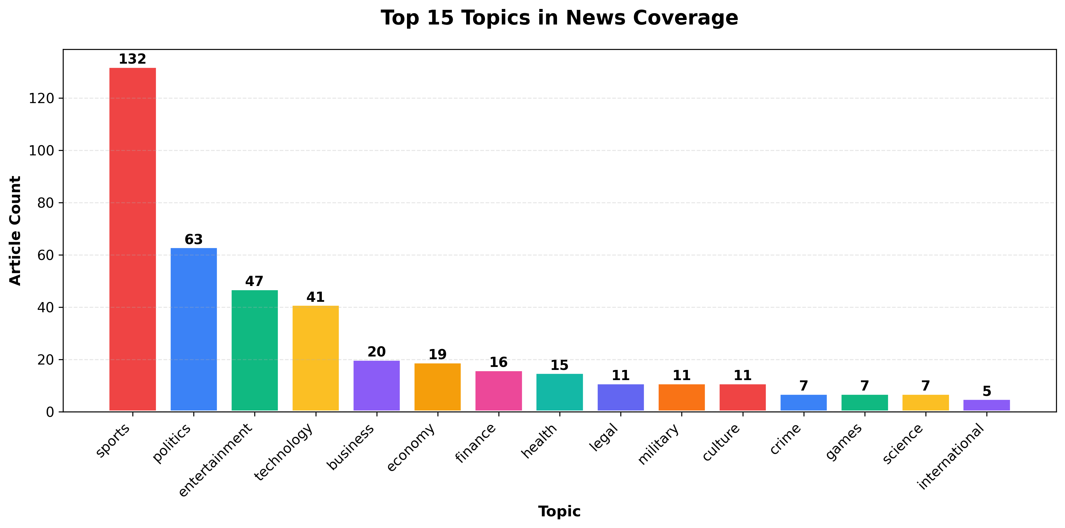
Now you’ll aggregate topics and create a vertical bar chart showing the most popular topics.
Extract and Count Topics
Section titled “Extract and Count Topics”# Extract topics from articlestopics = []for article in articles: article_topics = article.get("topics", []) if article_topics: # Topics is a list- add all topics from this article if isinstance(article_topics, list): topics.extend(article_topics) else: topics.append(article_topics)
# Exclude 'general' topic (articles not yet categorized)topics = [t for t in topics if t != 'general']
topic_counts = Counter(topics)print(f"Found {len(topic_counts)} unique topics (excluding 'general')")
# Get top 15 topics to avoid chart cluttertop_topics = dict(topic_counts.most_common(15))print(f"Displaying top 15 topics out of {len(topic_counts)} total")What this does:
- NewsDataHub returns
topicsas an array, not a single value - Each article can have multiple topics, so we use
extend()to add them all - Filters out
'general'— a placeholder for uncategorized articles Counteraggregates and counts topic occurrences- Limits to top 15 topics — Prevents clutter from rare topics with only 1-2 occurrences, making the chart readable
Create the Bar Chart
Section titled “Create the Bar Chart”# Color palette for data visualizationvibrant_colors = [ '#EF4444', # Red '#3B82F6', # Blue '#10B981', # Green '#FBBF24', # Yellow '#8B5CF6', # Purple '#F59E0B', # Orange '#EC4899', # Pink '#14B8A6', # Teal '#6366F1', # Indigo '#F97316' # Orange-red]
plt.figure(figsize=(12, 6))categories = list(top_topics.keys())values = list(top_topics.values())colors = [vibrant_colors[i % len(vibrant_colors)] for i in range(len(categories))]
bars = plt.bar(categories, values, color=colors, edgecolor='white', linewidth=2)
plt.title("Top 15 Topics in News Coverage", fontsize=16, fontweight="bold", pad=20)plt.xlabel("Topic", fontsize=12, fontweight="bold")plt.ylabel("Article Count", fontsize=12, fontweight="bold")plt.xticks(rotation=45, ha="right", fontsize=11)plt.yticks(fontsize=11)plt.grid(axis="y", linestyle="--", alpha=0.3)
# Add value labels on barsfor bar in bars: height = bar.get_height() plt.text(bar.get_x() + bar.get_width()/2., height, f'{int(height)}', ha='center', va='bottom', fontsize=11, fontweight='bold')
plt.tight_layout()plt.savefig("topic-distribution-chart.png", dpi=300, bbox_inches="tight")plt.show()Styling breakdown:
figsize=(12, 6)— Creates a wide chart to accommodate 15 categoriesvibrant_colors— Professional color palette optimized for data visualizationedgecolor='white', linewidth=2— White borders make bars stand outrotation=45, ha="right"— Rotates x-labels to prevent overlapgrid(axis="y")— Adds horizontal gridlines for easier value comparisontight_layout()— Prevents label cutoff- Value labels — Shows exact counts on top of each bar
savefig()— Exports high-resolution PNG for reports
Why Bar Charts for Topics?
Section titled “Why Bar Charts for Topics?”Bar charts are ideal for categorical data like topics because they:
- Show discrete categories clearly — Each bar represents a distinct topic
- Make comparisons easy — Heights directly correspond to frequency
- Reveal distribution patterns — Spot dominant vs. niche topics instantly
Step 3: Language Distribution with Horizontal Bars
Section titled “Step 3: Language Distribution with Horizontal Bars”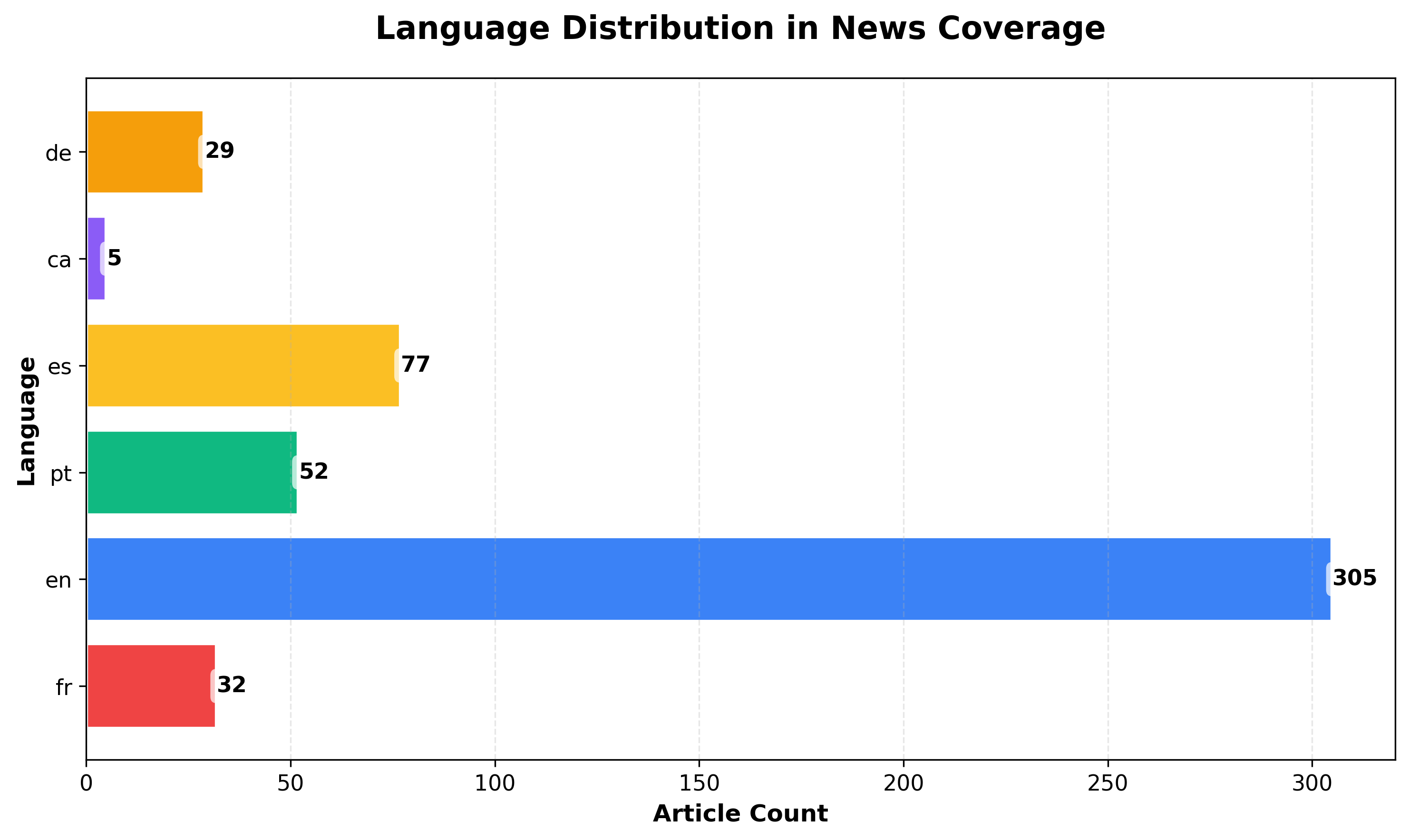
Horizontal bar charts work better when you have many categories or want to display labels without rotation.
Why this chart shows multiple languages: Because we filtered for multiple countries (US, France, Germany, Spain, Brazil) in Step 1, our dataset includes articles in English, French, German, Spanish, and Portuguese. If you filtered for a single country or language, this chart would only show one bar.
Extract Languages
Section titled “Extract Languages”languages = [ article.get("language") for article in articles if article.get("language")]
lang_counts = Counter(languages)Create Horizontal Bar Chart
Section titled “Create Horizontal Bar Chart”plt.figure(figsize=(10, 6))categories = list(lang_counts.keys())values = list(lang_counts.values())colors = [vibrant_colors[i % len(vibrant_colors)] for i in range(len(categories))]
bars = plt.barh(categories, values, color=colors, edgecolor='white', linewidth=2)
plt.title("Language Distribution in News Coverage", fontsize=16, fontweight="bold", pad=20)plt.xlabel("Article Count", fontsize=12, fontweight="bold")plt.ylabel("Language", fontsize=12, fontweight="bold")plt.xticks(fontsize=11)plt.yticks(fontsize=11)plt.grid(axis="x", alpha=0.3, linestyle="--")
# Add value labelsfor bar in bars: width = bar.get_width() plt.text(width, bar.get_y() + bar.get_height()/2., f'{int(width)}', ha='left', va='center', fontsize=11, fontweight='bold', bbox=dict(boxstyle='round,pad=0.3', facecolor='white', alpha=0.7, edgecolor='none'))
plt.tight_layout()plt.savefig("language-distribution-chart.png", dpi=300, bbox_inches="tight")plt.show()When to Use Horizontal Bars
Section titled “When to Use Horizontal Bars”Prefer horizontal orientation when:
- You have many categories (10+)
- Labels are long (horizontal text is easier to read than rotated text)
- Comparing similar values (horizontal layout makes small differences clearer)
- Sorting alphabetically (creates a natural top-to-bottom reading flow)
Step 4: Top 10 News Sources Analysis
Section titled “Step 4: Top 10 News Sources Analysis”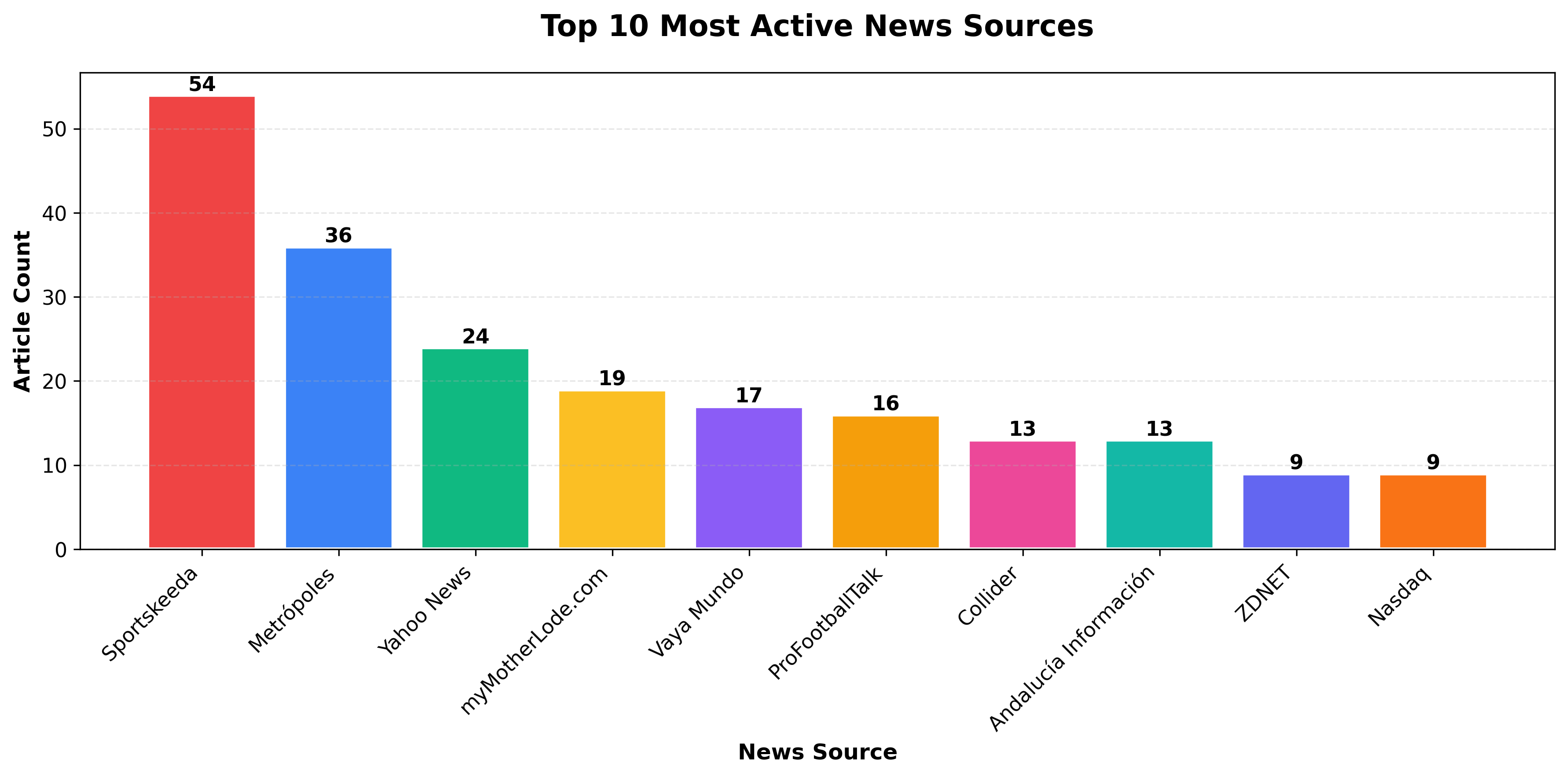
Analyzing source distribution helps identify the most active publishers and potential dataset biases.
Extract and Rank Sources
Section titled “Extract and Rank Sources”Next, we extract the source name from each article and count how often each appears. In the NewsDataHub response, the source name is stored in the top-level source_title field. We use Python’s Counter to tally occurrences and grab the top 10 most frequent sources.
Note: The NewsDataHub API free tier does not include source metadata, topics, or keywords. But the sample data includes these fields, so you can follow along with the full analysis.
sources = [article.get("source_title") for article in articles if article.get("source_title")]
source_counts = Counter(sources)top10 = source_counts.most_common(10)
print("Top 10 most active sources:")for rank, (source, count) in enumerate(top10, 1):    print(f"{rank}. {source}: {count} articles")
Create Top 10 Chart
Section titled “Create Top 10 Chart”plt.figure(figsize=(12, 6))categories = [x[0] for x in top10]values = [x[1] for x in top10]colors = [vibrant_colors[i % len(vibrant_colors)] for i in range(len(categories))]
bars = plt.bar(categories, values, color=colors, edgecolor='white', linewidth=2)
plt.title("Top 10 Most Active News Sources", fontsize=16, fontweight="bold", pad=20)plt.xlabel("News Source", fontsize=12, fontweight="bold")plt.ylabel("Article Count", fontsize=12, fontweight="bold")plt.xticks(rotation=45, ha="right", fontsize=11)plt.yticks(fontsize=11)plt.grid(axis="y", alpha=0.3, linestyle="--")
# Add value labelsfor bar in bars: height = bar.get_height() plt.text(bar.get_x() + bar.get_width()/2., height, f'{int(height)}', ha='center', va='bottom', fontsize=11, fontweight='bold')
plt.tight_layout()plt.savefig("top-sources-chart.png", dpi=300, bbox_inches="tight")plt.show()Why Analyze Sources?
Section titled “Why Analyze Sources?”Understanding source distribution helps you:
- Identify dominant publishers — See which outlets produce the most content
- Detect dataset bias — Over-representation of certain sources may skew analysis
- Assess coverage diversity — Balanced distribution suggests varied perspectives
- Plan data collection — Adjust filters if you need more source diversity
Bonus: Sort by Value for Better Readability
Section titled “Bonus: Sort by Value for Better Readability”# Sort top 10 by count (descending)top10_sorted = sorted(top10, key=lambda x: x[1], reverse=True)categories = [x[0] for x in top10_sorted]values = [x[1] for x in top10_sorted]colors = [vibrant_colors[i % len(vibrant_colors)] for i in range(len(categories))]
plt.bar(categories, values, color=colors, edgecolor='white', linewidth=2)# ... rest of chart codeOptional: Political Leaning Analysis
Section titled “Optional: Political Leaning Analysis”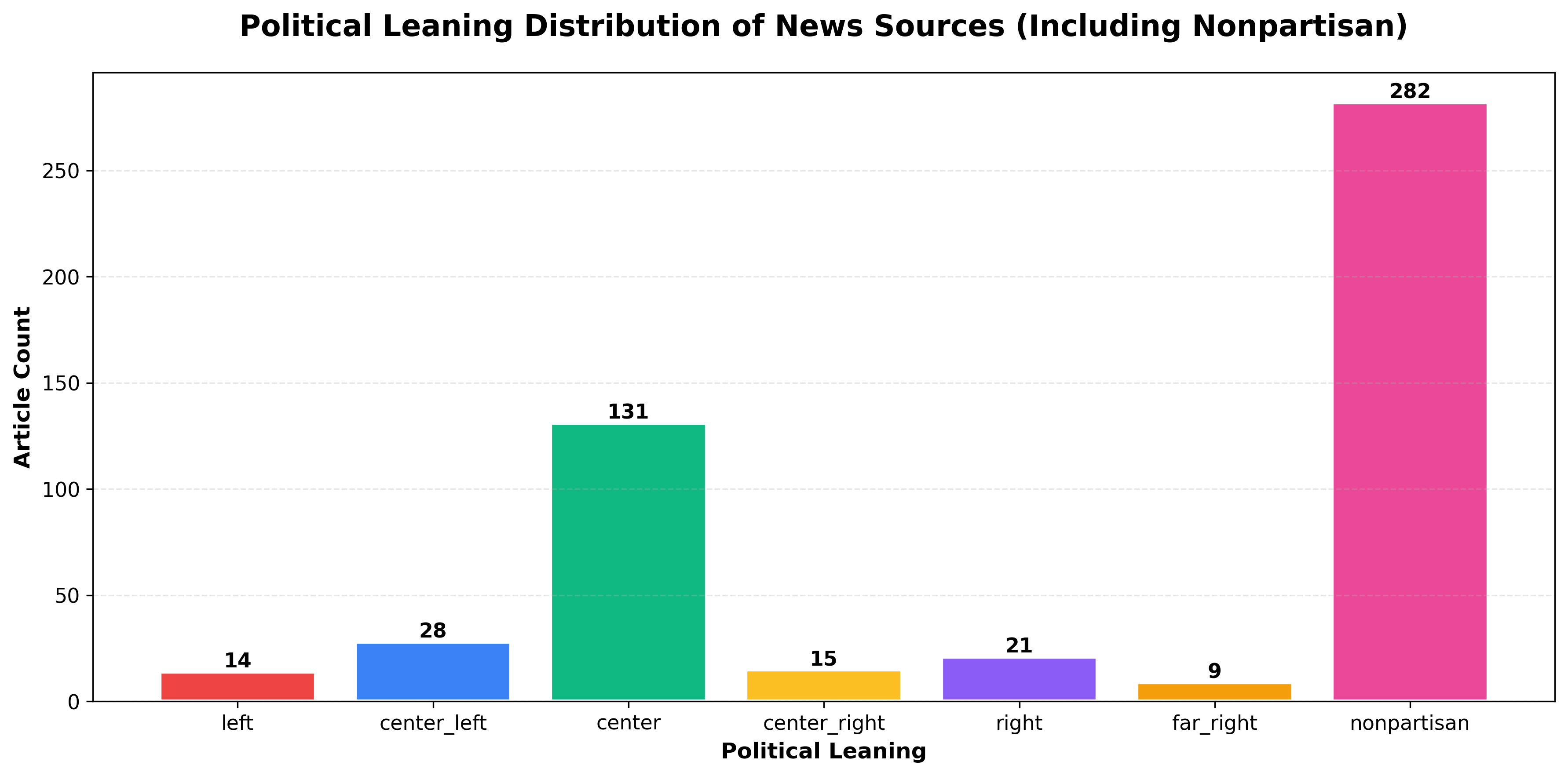
NewsDataHub includes political leaning metadata for sources, ranging from far-left to far-right. This enables bias analysis across your dataset.
Note: Political leaning data requires a paid NewsDataHub plan. Check newsdatahub.com/plans for feature availability.
Extract Political Leaning
Section titled “Extract Political Leaning”leanings = [ article.get("source", {}).get("political_leaning") for article in articles if article.get("source", {}).get("political_leaning")]
leaning_counts = Counter(leanings)Visualize Bias Distribution
Section titled “Visualize Bias Distribution”print(f"Political leaning: {len(leanings)} out of {len(articles)} articles have leaning data")
# Define order: left to right political spectrum + nonpartisan# 'nonpartisan' represents wire services (AP, Reuters, AFP) and fact-based outletsorder = ['far_left', 'left', 'center_left', 'center', 'center_right', 'right', 'far_right', 'nonpartisan']categories = [cat for cat in order if cat in leaning_counts]values = [leaning_counts[cat] for cat in categories]
plt.figure(figsize=(12, 6))colors = [vibrant_colors[i % len(vibrant_colors)] for i in range(len(categories))]bars = plt.bar(categories, values, color=colors, edgecolor='white', linewidth=2)
plt.title('Political Leaning Distribution of News Sources', fontsize=16, fontweight='bold', pad=20)plt.xlabel('Political Leaning', fontsize=12, fontweight='bold')plt.ylabel('Article Count', fontsize=12, fontweight='bold')plt.xticks(rotation=45, ha='right', fontsize=11)plt.yticks(fontsize=11)plt.grid(axis='y', alpha=0.3, linestyle='--')
# Add value labelsfor bar in bars: height = bar.get_height() plt.text(bar.get_x() + bar.get_width()/2., height, f'{int(height)}', ha='center', va='bottom', fontsize=11, fontweight='bold')
plt.tight_layout()plt.savefig('political-leaning-chart.png', dpi=300, bbox_inches='tight')plt.show()Understanding the categories:
- Political spectrum (far_left → far_right) — Sources with identifiable political bias
- Nonpartisan — Wire services (AP, Reuters, AFP) and fact-based outlets that maintain editorial neutrality
Note: Nonpartisan sources often make up a significant portion of the dataset, as they include major wire services that distribute content globally.
Use cases for political leaning analysis:
- Media bias research — Understand ideological balance in coverage
- Comparative topic analysis — See how different sides cover the same story
- Source diversity metrics — Ensure balanced representation in news aggregators
- Trend analysis — Track how political coverage shifts over time
For more on filtering by political leaning, see Filter News by Political Leaning.
Best Practices for Professional Bar Charts
Section titled “Best Practices for Professional Bar Charts”1. Use Consistent Color Palettes
Section titled “1. Use Consistent Color Palettes”A consistent color palette makes your charts look polished and helps readers focus on the data rather than decoding random colors. Pick a palette and define it once at the top of your script:
# Define your color palette once at the top of your scriptvibrant_colors = [ '#EF4444', # Red '#3B82F6', # Blue '#10B981', # Green '#FBBF24', # Yellow '#8B5CF6', # Purple '#F59E0B', # Orange '#EC4899', # Pink '#14B8A6', # Teal '#6366F1', # Indigo '#F97316' # Orange-red]Then reference it in your charts - this keeps your visuals cohesive and makes future updates easier (change colors in one place, not ten).
Choosing a palette:
- For general use: The vibrant palette above works well for most bar charts with up to 10 categories.
- For accessibility: colorbrewer2.org offers palettes designed for colorblind-friendly visualization and print.
- For branded reports: Use your organization’s brand colors to keep charts consistent with other materials.
2. Sort Categories Logically
Section titled “2. Sort Categories Logically”The order of bars affects how easily readers interpret your chart. A random arrangement forces viewers to scan back and forth; a logical order tells a story at a glance.
# Sort by frequency (most common first) - best for rankingssorted_items = topic_counts.most_common()
# Sort alphabetically - useful when readers need to find specific categoriessorted_items = sorted(topic_counts.items(), key=lambda x: x[0])
# Sort by custom order - use when categories have inherent sequencecustom_order = ["far-left", "left", "center", "right", "far-right"]sorted_items = [(k, topic_counts[k]) for k in custom_order if k in topic_counts]
Which sorting to use:
- Frequency: Default choice for most bar charts. Puts the most important data first and creates a natural visual hierarchy.
- Alphabetical: Works well for reference charts where readers look up specific items (e.g., countries, source names).
- Custom order: Essential when categories have a natural sequence - time periods, rating scales, or spectrums like political leaning.
3. Prevent Label Overlap
Section titled “3. Prevent Label Overlap”Long or numerous category labels often collide, making your chart unreadable. Matplotlib won’t fix this automatically, so plan for it.
# Rotate x-axis labelsplt.xticks(rotation=45, ha="right")
# OR use horizontal bars for many categoriesplt.barh(...)
# OR limit to top N categoriestop_n = topic_counts.most_common(10)
When to use each approach:
- Rotation (45°): Works for 5–10 categories with medium-length labels. Use ha=“right” to align rotated text cleanly.
- Horizontal bars: The best option when you have many categories (10+) or labels longer than a few words. Readers can scan top-to-bottom without tilting their heads.
- Limit categories: If you have dozens of categories, showing all of them creates noise. Display the top 10 (or top 5) and consider grouping the rest as “Other” if the total matters.
4. Export High-Resolution Images
Section titled “4. Export High-Resolution Images”Default exports often look blurry in presentations or print. A few extra parameters ensure your charts stay crisp.
# PNG at 300 DPI - standard for reports and slidesplt.savefig("chart.png", dpi=300, bbox_inches="tight")
# SVG - scalable format for web, stays sharp at any sizeplt.savefig("chart.svg", bbox_inches="tight")
Choosing a format:
- PNG (300 DPI): Best for documents, slide decks, and email. The dpi=300 setting produces print-quality resolution.
- SVG: Ideal for websites or interactive dashboards. Vector format means no pixelation regardless of zoom level.
- bbox_inches=“tight”: Prevents Matplotlib from cropping labels or adding excessive whitespace around your chart.
Tip: Save both formats if you’re unsure where the chart will end up - it takes one extra line and covers all use cases.
Working Within API Rate Limits
Section titled “Working Within API Rate Limits”NewsDataHub free tier offers 100 API calls per day. Here’s how to maximize your usage:
Cache Data During Development
Section titled “Cache Data During Development”import json
# Save fetched data to diskwith open("cached_news.json", "w") as f: json.dump(articles, f, indent=2)
# Load from cache instead of making API callswith open("cached_news.json", "r") as f: articles = json.load(f)Benefits:
- Iterate faster — No waiting for API responses during chart tweaking
- Preserve quota — Save API calls for fresh data collection
- Reproducibility — Analyze the same dataset across sessions
Maximize each request
Section titled “Maximize each request”Use the per_page query parameter to fetch up to 100 articles per call (available on all tiers, including free). Two well-structured requests can give you 200 articles for analysis.
Track Your Usage
Section titled “Track Your Usage”import datetime
# Log each API calldef fetch_with_logging(url, headers, params): response = requests.get(url, headers=headers, params=params) print(f"[{datetime.datetime.now()}] API call made. Status: {response.status_code}") return response
# Count calls per sessionapi_calls = 0for _ in range(2): response = fetch_with_logging(url, headers, params) api_calls += 1print(f"Total API calls this session: {api_calls}")Plan Your Data Collection
Section titled “Plan Your Data Collection”- Daily analysis — Fetch 100 articles/day for time-series tracking
- Weekly deep dives — Accumulate 700 articles over a week
- Upgrade when needed — Visit newsdatahub.com/plans for higher limits
- What types of data work best with bar charts?
Bar charts excel with categorical data: topics, languages, sources, countries, sentiment categories, or any discrete grouping. For continuous numerical data (like stock prices over time), use line charts instead.
- When should I use horizontal vs. vertical bars?
Use vertical bars for 3-10 categories with short labels. Switch to horizontal bars when you have 10+ categories, long category names, or want alphabetical sorting (easier to read top-to-bottom than rotated text).
- How do I handle too many categories?
Limit to top N (e.g., most_common(10)), group rare categories into “Other”, or use a different chart type (treemap, word cloud).
- Why use
Counterinstead of manual counting?
Counter from Python’s collections module is optimized for frequency counting, provides useful methods like most_common(), and handles missing keys gracefully.
- How can I make charts interactive?
Switch from Matplotlib to Plotly for interactive charts:
import plotly.express as pxfig = px.bar(x=list(topic_counts.keys()), y=list(topic_counts.values()))fig.show()- Can I combine multiple datasets in one chart?
Yes, use grouped or stacked bars:
# Grouped bars (side-by-side comparison)x = np.arange(len(categories))width = 0.35plt.bar(x - width/2, dataset1, width, label='Dataset 1')plt.bar(x + width/2, dataset2, width, label='Dataset 2')plt.legend()- What if my API key doesn’t work?
Verify:
- Key is correct (check your dashboard)
- Header name is
x-api-key(lowercase, with hyphens) - You haven’t exceeded rate limits
- Network/firewall isn’t blocking API requests
- How do I filter for specific topics or countries?
Add parameters to your API request:
params = { "per_page": 100, "topic": "technology", "country": "US"}See NewsDataHub Search & Filtering Guide for all available filters.
- How fresh is the data?
NewsDataHub updates continuously. Data freshness depends on your plan tier. Visit newsdatahub.com/plans for details.