
How to Create a Circular "News Wheel" with Python: Topic Distribution Using Polar Charts
Quick Answer: This tutorial teaches you how to create a circular “news wheel” visualization using Python’s polar area charts to display news topic distribution. You’ll learn to transform categorical data into engaging radial visualizations using real news data from the NewsDataHub API.
Perfect for: Python developers, data analysts, journalists, and anyone building news analytics dashboards or learning creative data visualization techniques.
Time to complete: 15-20 minutes
Difficulty: Beginner
Stack: Python, Matplotlib, NumPy, NewsDataHub API
What You’ll Build
Section titled “What You’ll Build”You’ll create a circular “news wheel” polar area chart that visualizes topic distribution across news articles:
- Polar area chart — Transform topic counts into an engaging circular visualization
- Topic aggregation — Extract and count topics from news articles using Counter
- Professional styling — Apply vibrant colors and clear labels for publication-ready charts
- Top-N filtering — Display the top 10 topics to prevent visual clutter
By the end, you’ll understand when to use polar charts vs. bar charts and how to create compelling circular visualizations for categorical data.
Prerequisites
Section titled “Prerequisites”Required Tools
Section titled “Required Tools”- Python 3.7+
- pip package manager
Install Required Packages
Section titled “Install Required Packages”pip install requests matplotlib numpyAPI Key
Section titled “API Key”- NewsDataHub API key — Get free key
For current API quotas and rate limits, visit newsdatahub.com/plans.
Knowledge Prerequisites
Section titled “Knowledge Prerequisites”- Basic Python syntax
- Familiarity with lists and dictionaries
- Understanding of loops and functions
Understanding Polar Area Charts
Section titled “Understanding Polar Area Charts”What Are Polar Area Charts?
Section titled “What Are Polar Area Charts?”A polar area chart (also called a rose chart or radial chart) is a circular visualization where data is represented as wedge-shaped segments radiating from a central point. Think of it as a pie chart’s more sophisticated cousin—it shows both category proportions and absolute values through the radial distance from the center.
Unlike bar charts that use rectangular bars on a linear axis, polar charts arrange categories in a circle, making them ideal for:
- Categorical distributions — Showing how items are spread across different categories
- Comparative analysis — Visually comparing multiple categories at once
- Engaging presentation — Creating eye-catching visualizations for reports and dashboards
- Visual impact — Better for presentations where memorability matters
Polar Charts vs. Bar Charts: When to Use Which?
Section titled “Polar Charts vs. Bar Charts: When to Use Which?”Use bar charts when:
- You want to emphasize ranking or hierarchy
- Categories have a natural order (small → medium → large)
- You need maximum precision in reading values
- Space is limited vertically
 Bar charts excel at precise comparisons and rankings
Use polar charts when:
- You want an engaging, memorable visualization
- All categories are equally important (no implied hierarchy)
- Visual impact matters (presentations, social media, dashboards)
- You want to show both proportions and absolute values
Use treemaps when:
- You have more than 15 categories to display
- You want to show hierarchical proportions without clutter
- Space efficiency matters
 Treemaps handle many categories efficiently
Use pie or donut charts when:
- You want to emphasize parts of a whole
- You need simple percentage breakdowns
- You have fewer than 7 categories
 Donut charts show percentage distributions clearly
For news topic analysis, a polar chart works beautifully because all topics (politics, sports, technology, etc.) are equally valid categories with no inherent order.
How to Interpret Polar Area Charts
Section titled “How to Interpret Polar Area Charts”When reading a polar area chart:
- Larger wedges = more articles — The segment that extends furthest from center has the most coverage
- Visual comparison — You can quickly spot which topics dominate vs. which are underrepresented
- Color distinction — Different colors help identify each topic at a glance
- Radial distance — Each concentric circle represents an increment in article count
Step 1: Fetch News Data
Section titled “Step 1: Fetch News Data”We’ll retrieve news articles to analyze. You have two options:
With an API key: The script fetches live data from NewsDataHub, using cursor-based pagination to retrieve multiple pages.
Without an API key: The script downloads a sample dataset from GitHub, so you can follow along without signing up.
Fetching Articles
Section titled “Fetching Articles”import requestsimport matplotlib.pyplot as pltimport numpy as npfrom collections import Counterimport jsonimport os
# Set your API key here (or leave empty to use sample data)API_KEY = "" # Replace with your NewsDataHub API key, or leave empty
# Initialize articles listarticles = []
# Check if API key is providedif API_KEY and API_KEY != "your_api_key_here": print("Using live API data...")
url = "https://api.newsdatahub.com/v1/news" headers = { "x-api-key": API_KEY, "User-Agent": "circular-news-wheel-topic-distribution/1.0-py" }
# Make 3 API calls to get more data for call_num in range(1, 4): print(f" Fetching batch {call_num}/3...") params = {"per_page": 100} # Maximum allowed on free tier
response = requests.get(url, headers=headers, params=params) response.raise_for_status() batch_articles = response.json().get("data", []) articles.extend(batch_articles)
print(f" - Fetched {len(batch_articles)} articles")
print(f"\nTotal articles fetched: {len(articles)}")
else: print("No API key provided. Loading sample data...")
# Download and load 3 sample data files sample_files = [ ("sample-news-data-1.json", "https://raw.githubusercontent.com/newsdatahub/newsdatahub-data-science-tutorials/5a8dc14f5c8a0e08eb9f621611b92c8e89903c4a/tutorials/circular-news-wheel/data/sample-news-data-1.json"), ("sample-news-data-2.json", "https://raw.githubusercontent.com/newsdatahub/newsdatahub-data-science-tutorials/5a8dc14f5c8a0e08eb9f621611b92c8e89903c4a/tutorials/circular-news-wheel/data/sample-news-data-2.json"), ("sample-news-data-3.json", "https://raw.githubusercontent.com/newsdatahub/newsdatahub-data-science-tutorials/5a8dc14f5c8a0e08eb9f621611b92c8e89903c4a/tutorials/circular-news-wheel/data/sample-news-data-3.json") ]
for sample_file, sample_url in sample_files: # Download if not already present if not os.path.exists(sample_file): print(f" Downloading {sample_file}...") response = requests.get(sample_url) response.raise_for_status() with open(sample_file, "w") as f: json.dump(response.json(), f)
# Load sample data with open(sample_file, "r") as f: data = json.load(f)
# Handle both formats: raw array or API response with 'data' key if isinstance(data, dict) and "data" in data: batch_articles = data["data"] elif isinstance(data, list): batch_articles = data else: raise ValueError(f"Unexpected sample data format in {sample_file}")
articles.extend(batch_articles) print(f" - Loaded {len(batch_articles)} articles from {sample_file}")
print(f"\nTotal articles loaded: {len(articles)}")Expected output (with API key):
Using live API data...  Fetching batch 1/3...  - Fetched 100 articles  Fetching batch 2/3...  - Fetched 100 articles  Fetching batch 3/3...  - Fetched 100 articles
Total articles fetched: 300
Expected output (without API key):
No API key provided. Loading sample data...  Downloading sample-news-data-1.json...  - Loaded 100 articles from sample-news-data-1.json  - Loaded 100 articles from sample-news-data-2.json  - Loaded 100 articles from sample-news-data-3.json
Total articles loaded: 300
Understanding the Code
Section titled “Understanding the Code”- Dual mode operation — Works with live API data or sample data fallback
- 3 API calls — Fetches 300 articles total (3 batches of 100) for richer analysis
- Sample data fallback — Automatically downloads and uses sample data if no API key provided
- Progress tracking — Shows batch-by-batch progress for better user experience
.extend()method — Accumulates articles from multiple batches into single listraise_for_status()— Throws an error for 4XX/5XX HTTP responses- Format flexibility — Handles both array and object response formats
Why 3 calls: With 300 articles instead of 100, topic distribution patterns become more reliable and representative. You’ll use 3 of your 100 daily API calls, leaving plenty of quota for experimentation.
Step 2: Extract and Count Topics
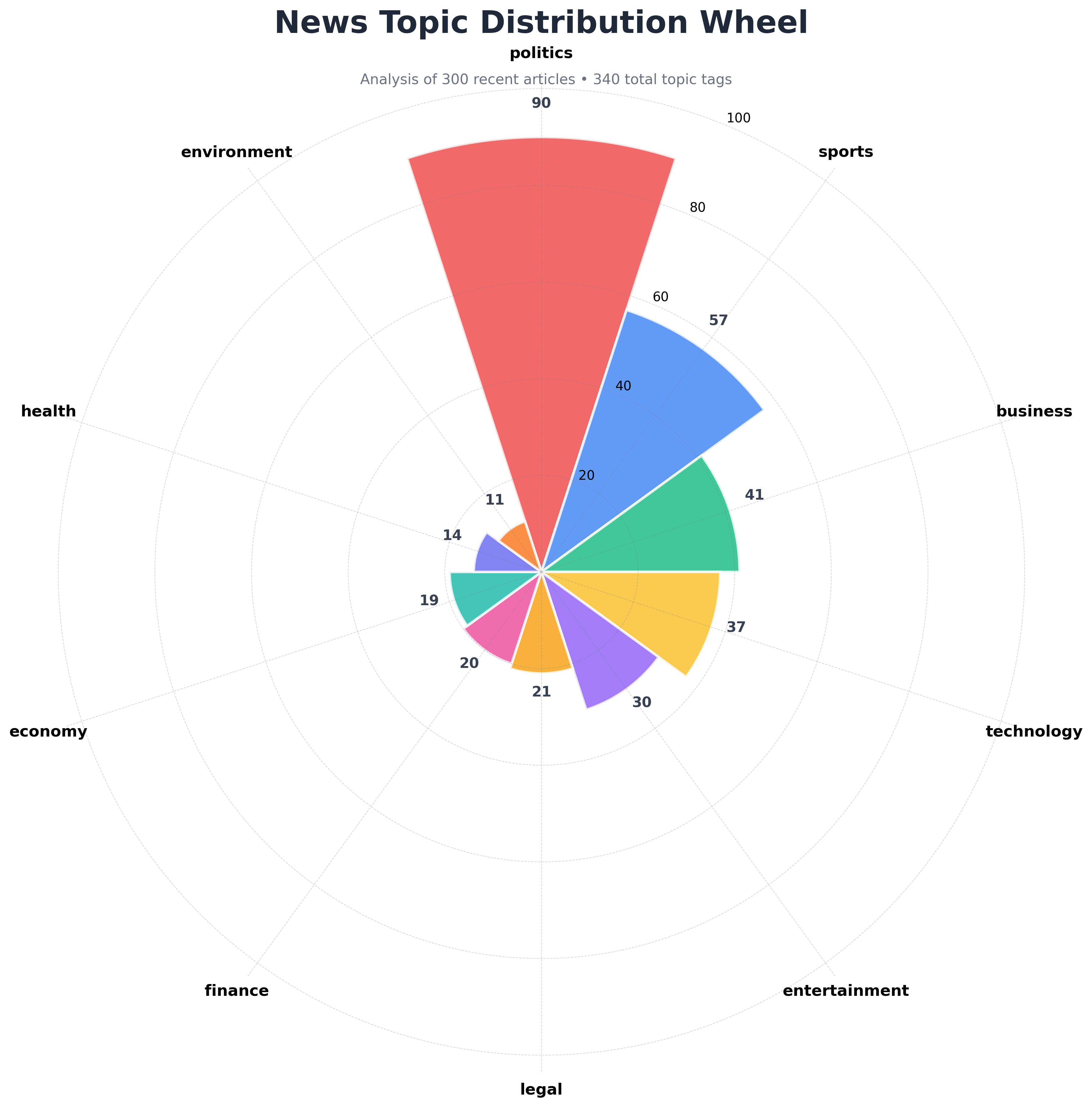
Section titled “Step 2: Extract and Count Topics”NewsDataHub categorizes articles with topics like “politics”, “business”, “technology”, “sports”, “entertainment”, “health”, and more. Each article can have one or more topic tags.
Aggregate Topic Data
Section titled “Aggregate Topic Data”# Extract all topics from articlesall_topics = []for article in articles: topics = article.get("topics", []) # Topics is an array - an article can have multiple topics if topics: all_topics.extend(topics)
print(f"\nTotal topic mentions: {len(all_topics)}")
# Exclude 'general' topic (articles not yet categorized)all_topics = [t for t in all_topics if t != 'general']
# Count occurrences of each topictopic_counts = Counter(all_topics)
# Get top 10 topics (to avoid overcrowding the chart)top_topics = topic_counts.most_common(10)
# Separate into labels and valueslabels = [topic for topic, count in top_topics]values = [count for topic, count in top_topics]
print(f"Found {len(topic_counts)} unique topics (excluding 'general')")print(f"Displaying top 10 topics out of {len(topic_counts)} total")print(f"\nTop 10 topics:")for topic, count in top_topics: print(f" {topic}: {count}")What this does:
- Loops through each article and extracts its topics array
- Uses
extend()to add all topics to a single list (since articles can have multiple topics) - Excludes ‘general’ topic — NewsDataHub uses ‘general’ for uncategorized articles; we filter it out for meaningful analysis
- Uses
Counterfrom Python’scollectionsmodule to efficiently tally occurrences - Selects the top 10 most frequent topics to keep the visualization clean
- Separates topic names (labels) from their counts (values)
Note: Since articles can have multiple topics, the total count might exceed the number of articles. This is expected and provides a more accurate view of topic coverage.
Step 3: Create the Polar Area Chart
Section titled “Step 3: Create the Polar Area Chart”Now let’s transform our topic counts into a beautiful circular visualization.
Build the News Wheel
Section titled “Build the News Wheel”# Number of categoriesnum_topics = len(labels)
# Set up the polar plotfig = plt.figure(figsize=(12, 12))ax = fig.add_subplot(111, projection='polar')
# Define vibrant color palettevibrant_colors = [ '#EF4444', # Red '#3B82F6', # Blue '#10B981', # Green '#FBBF24', # Yellow '#8B5CF6', # Purple '#F59E0B', # Orange '#EC4899', # Pink '#14B8A6', # Teal '#6366F1', # Indigo '#F97316' # Deep Orange]
# Calculate angles for each segment (in radians)angles = np.linspace(0, 2 * np.pi, num_topics, endpoint=False).tolist()
# Create the polar area chartbars = ax.bar( angles, values, width=2*np.pi/num_topics, # Width of each segment color=vibrant_colors[:num_topics], edgecolor='white', linewidth=2, alpha=0.8)
# Customize the chartax.set_theta_zero_location('N') # Start at topax.set_theta_direction(-1) # Clockwise directionax.set_xticks(angles)ax.set_xticklabels(labels, fontsize=12, fontweight='600')ax.set_ylim(0, max(values) * 1.15) # Add 15% padding for labels
# Style the radial gridax.grid(True, color='gray', alpha=0.3, linestyle='--', linewidth=0.5)
# Remove the outer circular border/spine for a cleaner lookax.spines['polar'].set_visible(False)
ax.set_title( 'News Topic Distribution Wheel', fontsize=24, fontweight='bold', pad=30, color='#1F2937')
# Add value labels on each segmentfor angle, count, bar in zip(angles, values, bars): if count > 0: height = bar.get_height() ax.text( angle, height + max(values) * 0.06, str(count), ha='center', va='bottom', fontsize=11, fontweight='bold', color='#374151' )
# Add a subtitle with contexttotal_tags = sum(values)fig.text( 0.5, 0.92, f'Analysis of {len(articles)} recent articles • {total_tags} total topic tags', ha='center', fontsize=11, color='#6B7280')
plt.tight_layout()plt.savefig('topic_distribution_wheel.png', dpi=300, bbox_inches='tight', facecolor='white')
print("\n" + "="*60)print("Circular news wheel created successfully!")print("="*60)print("\nFile created: topic_distribution_wheel.png")print("\nVisualization features:")print(" - Segment size = number of articles per topic")print(" - Colors help distinguish between different topics")print(" - Clockwise arrangement starting from top")Styling Breakdown
Section titled “Styling Breakdown”Let’s understand the key styling decisions:
Circular Layout:
projection='polar'— Creates a polar coordinate system for circular chartsset_theta_zero_location('N')— Starts at the top (12 o’clock position)set_theta_direction(-1)— Clockwise rotation (intuitive reading)
Angle Calculation:
np.linspace(0, 2*np.pi, num_topics, endpoint=False)— Divides the circle evenly among topicswidth=2*np.pi/num_topics— Makes each wedge take up its proportional space
Color Selection:
- 10 vibrant, highly distinct colors optimized for data visualization
- Colors chosen to maximize visual distinction between adjacent segments
- Hex colors ensure consistency across platforms
edgecolor='white', linewidth=2— White borders separate adjacent segments clearly
Typography and Labels:
- Bold topic labels with appropriate sizing (fontsize=12, fontweight=‘600’)
- Value labels positioned above each bar for precise counts
- Clear title with context subtitle showing article count
- Professional color scheme (#1F2937 for title, #6B7280 for subtitle)
Visual Enhancements:
alpha=0.8— Semi-transparent bars for modern aesthetic- Dashed radial grid — Easier value reading without overwhelming the chart
- 15% padding —
max(values) * 1.15adds space above bars for labels - High DPI (300) — Publication-quality output for reports and presentations
- Context subtitle — Shows article count and total tags for transparency
- Spine removal —
ax.spines['polar'].set_visible(False)removes outer black ring for cleaner appearance
Working Within API Rate Limits
Section titled “Working Within API Rate Limits”NewsDataHub’s free tier offers 100 API calls per day. Here’s how to maximize your usage:
Cache Data During Development
Section titled “Cache Data During Development”import json
# Save fetched data to diskwith open("cached_news.json", "w") as f: json.dump(articles, f, indent=2)
# Load from cache instead of making API callswith open("cached_news.json", "r") as f: articles = json.load(f)Benefits:
- Iterate faster — No waiting for API responses during chart tweaking
- Preserve quota — Save API calls for fresh data collection
- Reproducibility — Analyze the same dataset across sessions
Track Your Usage
Section titled “Track Your Usage”import datetime
# Log each API calldef fetch_with_logging(url, headers, params): response = requests.get(url, headers=headers, params=params) print(f"[{datetime.datetime.now()}] API call made. Status: {response.status_code}") return response
response = fetch_with_logging(url, headers, params)Plan Your Data Collection
Section titled “Plan Your Data Collection”- Daily analysis — Fetch 100 articles/day for time-series tracking
- Multiple comparisons — Use cached data for development, fresh API calls for final analysis
- Upgrade when needed — Visit newsdatahub.com/plans for higher limits
Best Practices for Professional Polar Charts
Section titled “Best Practices for Professional Polar Charts”1. Limit to Top N Categories
Section titled “1. Limit to Top N Categories”Too many wedges (>15) create visual clutter. Focus on top categories:
# Show only top 8 topicstop_topics = topic_counts.most_common(8)2. Use Consistent Color Schemes
Section titled “2. Use Consistent Color Schemes”Pick a professional palette and stick with it:
# Topic-specific colors (optional - for semantic meaning)topic_colors = { 'politics': '#EF4444', # Red 'business': '#10B981', # Green 'technology': '#3B82F6', # Blue 'sports': '#F59E0B', # Orange 'entertainment': '#EC4899', # Pink 'health': '#14B8A6', # Teal 'science': '#8B5CF6' # Purple}For more color palettes, see ColorBrewer for data visualization.
3. Add Percentage Labels
Section titled “3. Add Percentage Labels”Show both count and percentage for additional context:
total = sum(values)for angle, count, bar in zip(angles, values, bars): height = bar.get_height() percentage = (count / total) * 100 label = f'{count}\n({percentage:.1f}%)' ax.text(angle, height + max(values) * 0.06, label, ha='center', va='bottom', fontsize=10, fontweight='bold')4. Export for Different Uses
Section titled “4. Export for Different Uses”# Print qualityplt.savefig('topic_wheel_print.png', dpi=300, bbox_inches='tight')
# Web/screen qualityplt.savefig('topic_wheel_web.png', dpi=96, bbox_inches='tight')
# Vector format for scalingplt.savefig('topic_wheel.svg', bbox_inches='tight')5. Experiment with Matplotlib Styles
Section titled “5. Experiment with Matplotlib Styles”Try different built-in styles for varied aesthetics:
plt.style.use('seaborn-v0_8-darkgrid') # Professional lookplt.style.use('ggplot') # R-inspired aestheticplt.style.use('fivethirtyeight') # Data journalism styleAdvanced Use Cases
Section titled “Advanced Use Cases”Once you’re comfortable with basic topic distribution wheels, try these extensions:
1. Regional Comparison
Section titled “1. Regional Comparison”Compare topic preferences across countries:
# Fetch US newsparams_us = {"per_page": 100, "country": "US"}headers_us = {    "x-api-key": "YOUR_API_KEY",    "User-Agent": "circular-news-wheel-topic-distribution/1.0-py"}response_us = requests.get(url, headers=headers_us, params=params_us)articles_us = response_us.json().get("data", [])
# Fetch UK newsparams_uk = {"per_page": 100, "country": "GB"}headers_uk = {    "x-api-key": "YOUR_API_KEY",    "User-Agent": "circular-news-wheel-topic-distribution/1.0-py"}response_uk = requests.get(url, headers=headers_uk, params=params_uk)articles_uk = response_uk.json().get("data", [])
# Create side-by-side comparisonfig, (ax1, ax2) = plt.subplots(1, 2, subplot_kw=dict(projection='polar'), figsize=(16, 8))# Plot US data on ax1, UK data on ax2
2. Temporal Evolution
Section titled “2. Temporal Evolution”Track how topic distribution changes throughout the day:
# Run at different times: 6 AM, 12 PM, 6 PM, 12 AM# Create 4-panel comparison showing topic shiftsfig, axes = plt.subplots(2, 2, subplot_kw=dict(projection='polar'), figsize=(16, 16))# Plot each time period in a different subplot3. Interactive Version with Plotly
Section titled “3. Interactive Version with Plotly”Use Plotly for web-based interactive charts:
import plotly.graph_objects as go
fig = go.Figure(go.Barpolar(    r=values,    theta=labels,    marker_color=vibrant_colors[:num_topics],    marker_line_color='white',    marker_line_width=2,    opacity=0.8))
fig.update_layout(    title='Interactive Topic Distribution Wheel',    polar=dict(        radialaxis=dict(visible=True, range=[0, max(values) * 1.1])    ))
fig.show()
For more on interactive visualizations, consider exploring Plotly’s documentation.
- When should I use polar charts vs. bar charts for categorical data?
Use polar charts when you want visual impact and all categories are equally important (no natural order). Use bar charts when you need precise value comparison, have a natural ordering, or need to emphasize ranking.
- How many categories can I display on a polar chart?
For readability, limit to 8-12 categories. More than 15 wedges create visual clutter. Use most_common(10) to show only top categories.
- Can I show negative values on a polar chart?
No, polar area charts only work with non-negative values since radial distance represents magnitude. For data with negative values, use bar charts or diverging bar charts instead.
- Why use Counter instead of manual counting?
Counter from Python’s collections module is optimized for frequency counting, provides useful methods like most_common(), and handles missing keys gracefully.
- How do I calculate the angle for each segment?
Use np.linspace(0, 2*np.pi, num_topics, endpoint=False) to divide a full circle (2π radians) evenly among your categories. The endpoint=False parameter ensures we don’t duplicate the starting position.
- Can I customize individual wedge colors based on values?
Yes! Use conditional logic to assign colors:
colors = ['#EF4444' if val > threshold else '#3B82F6' for val in values]- What if my API key doesn’t work?
Verify:
- Key is correct (check your dashboard)
- Header name is
x-api-key(lowercase, with hyphens) - You haven’t exceeded rate limits
- Network/firewall isn’t blocking API requests
- How do I filter for specific topics or countries?
Add parameters to your API request:
params = { "per_page": 100, "topic": "technology", "country": "US"}- Why do topic counts exceed the number of articles?
This is expected! Articles can have multiple topics. If 100 articles each have 2 topics on average, you’ll get 200 total topic tags. This provides a more accurate view of topic coverage.