
How to Create Chord Diagrams in Python to Visualize Topic Co-occurrence in News Data
Quick Answer: This tutorial teaches you how to create chord diagrams in Python using Matplotlib to visualize topic co-occurrence patterns in real news data from the NewsDataHub API. You’ll learn to build co-occurrence matrices and create professional relationship visualizations.
Perfect for: Python developers, data scientists, journalists, and anyone building network visualizations or analyzing relationships in categorical data.
Time to complete: 20-25 minutes
Difficulty: Intermediate
Stack: Python, Matplotlib, mpl_chord_diagram, NewsDataHub API
What You’ll Build
Section titled “What You’ll Build”You’ll create a chord diagram that visualizes how news topics co-occur across articles:
- Co-occurrence matrix — Calculate how often topic pairs appear together in articles
- Chord diagram — Circular visualization showing topic relationships
- Data filtering — Focus on top N topics for clarity
- Professional styling — High-resolution PNG output ready for reports and presentations
By the end, you’ll understand when to use chord diagrams for relationship visualization and have working code for analyzing news topic networks.
Prerequisites
Section titled “Prerequisites”Required Tools
Section titled “Required Tools”- Python 3.7+
- pip package manager
Install Required Packages
Section titled “Install Required Packages”pip install requests matplotlib mpl_chord_diagramAPI Key
Section titled “API Key”- NewsDataHub API key — Get free key
For current API quotas and rate limits, visit newsdatahub.com/plans.
Knowledge Prerequisites
Section titled “Knowledge Prerequisites”- Basic Python syntax (loops, dictionaries, list comprehensions)
- Understanding of categorical data
- Familiarity with basic data visualization concepts
Understanding Chord Diagrams: Foundational Concepts
Section titled “Understanding Chord Diagrams: Foundational Concepts”What Are Chord Diagrams?
Section titled “What Are Chord Diagrams?”A chord diagram is a circular visualization that shows relationships and flows between entities. Unlike bar charts that compare individual values, chord diagrams reveal connections and co-occurrences between multiple categories.
Key elements:
- Arcs (outer ring) — Represent categories (in our case, news topics)
- Ribbons (inner connections) — Show relationships between categories
- Ribbon thickness — Indicates the strength of the relationship
When to Use Chord Diagrams
Section titled “When to Use Chord Diagrams”Chord diagrams are ideal when you want to:
- Visualize many-to-many relationships between categories
- Show the strength of connections between items
- Identify clusters and patterns in network data
- Display flow or co-occurrence data in a compact, intuitive way
Good use cases: Topic co-occurrence, migration flows, trade relationships, user journey flows, collaboration networks
Poor use cases: Simple comparisons (use bar charts), hierarchical data (use tree maps), continuous time series (use line charts), single-variable distributions (use histograms)
Understanding Co-occurrence
Section titled “Understanding Co-occurrence”Co-occurrence measures how often two items appear together. In news analysis:
- If an article is tagged with both “technology” and “business,” that’s one co-occurrence
- Count all such pairs across your dataset to build a co-occurrence matrix
- The matrix shows relationship strength: higher numbers mean topics frequently appear together
For example, if “climate” and “policy” appear together in 45 articles, while “climate” and “technology” appear together in 12 articles, the chord diagram would show a thicker ribbon between “climate” and “policy.”
How to Interpret Chord Diagrams
Section titled “How to Interpret Chord Diagrams”When reading a chord diagram:
- Thicker ribbons = stronger connections — Topics that frequently co-occur have thick ribbons
- Arc size = total involvement — Larger arcs indicate topics with many connections
- Ribbon color — Usually gradient between connected topics, helping trace relationships
- Symmetry — Ribbons connect both directions, so the diagram shows the full relationship network
Best Practices for Relationship Visualizations
Section titled “Best Practices for Relationship Visualizations”- Limit categories — Too many categories (>15) create cluttered diagrams; focus on top N
- Use meaningful colors — Distinct colors for each category aid comprehension
- Add transparency — Semi-transparent ribbons prevent visual overload when many overlap
- Include clear labels — Ensure category names are readable around the circle
- Filter weak connections — Remove very small relationships to reduce noise
Step 1: Fetch News Data
Section titled “Step 1: Fetch News Data”We’ll retrieve news articles to analyze. You have two options:
With an API key: The script fetches live data from NewsDataHub, using cursor-based pagination to retrieve multiple pages.
Without an API key: The script downloads a sample dataset from GitHub, so you can follow along without signing up.
Fetching Articles
Section titled “Fetching Articles”import requestsimport matplotlib.pyplot as pltfrom mpl_chord_diagram import chord_diagramfrom collections import defaultdict, Counterimport jsonimport os
# Set your API key here (or leave empty to use sample data)API_KEY = "" # Replace with your NewsDataHub API key, or leave empty
# Check if API key is providedif API_KEY and API_KEY != "your_api_key": print("Using live API data...")
url = "https://api.newsdatahub.com/v1/news" headers = { "x-api-key": API_KEY, "User-Agent": "chord-diagram-topic-cooccurrence/1.0-py" } params = {"per_page": 100}
# Fetch data response = requests.get(url, headers=headers, params=params) response.raise_for_status() articles = response.json().get("data", [])
print(f"Fetched {len(articles)} articles from API")
else: print("No API key provided. Loading sample data...")
# Download sample data if not already present sample_file = "sample-news-data.json"
if not os.path.exists(sample_file): print("Downloading sample data...") sample_url = "https://raw.githubusercontent.com/newsdatahub/newsdatahub-data-science-tutorials/main/tutorials/bar-charts-news-data/data/sample-news-data.json" response = requests.get(sample_url) with open(sample_file, "w") as f: json.dump(response.json(), f) print(f"Sample data saved to {sample_file}")
# Load sample data with open(sample_file, "r") as f: data = json.load(f)
# Handle both formats: raw array or API response with 'data' key if isinstance(data, dict) and "data" in data: articles = data["data"] elif isinstance(data, list): articles = data else: raise ValueError("Unexpected sample data format")
print(f"Loaded {len(articles)} articles from sample data")Expected output (API mode):
Using live API data...Fetched 100 articles from APIExpected output (sample data mode):
No API key provided. Loading sample data...Sample data saved to sample-news-data.jsonLoaded 100 articles from sample dataUnderstanding the Code
Section titled “Understanding the Code”x-api-keyheader — Authenticates your request (replace with your actual key)per_pageparameter — Controls how many articles to fetch (max 100)raise_for_status()— Throws an error for 4XX/5XX HTTP responses.get("data", [])— Safely extracts article array from JSON response
Step 2: Extract Topics and Build Co-occurrence Matrix
Section titled “Step 2: Extract Topics and Build Co-occurrence Matrix”Now we’ll extract topics from articles and calculate how often each pair of topics appears together.
Extract Topics from Articles
Section titled “Extract Topics from Articles”# Extract topics from articlesarticle_topics = []for article in articles: topics = article.get("topics", []) if topics and len(topics) >= 2: # Need at least 2 topics for co-occurrence article_topics.append(topics)
print(f"Found {len(article_topics)} articles with 2+ topics")What this does:
- NewsDataHub returns
topicsas an array for each article - We only keep articles with 2 or more topics (required for co-occurrence)
- Articles with a single topic or no topics are filtered out
Count Topic Frequencies
Section titled “Count Topic Frequencies”# Count individual topic frequencies to get top topicstopic_counter = Counter()for topics in article_topics: topic_counter.update(topics)
# Select top N topics for visualization clarityTOP_N = 8top_topics = [topic for topic, count in topic_counter.most_common(TOP_N)]
print(f"Top {TOP_N} topics: {top_topics}")Why limit to top 8 topics?
- Chord diagrams become cluttered with too many categories
- 6-12 categories is the sweet spot for readability
- You can adjust TOP_N based on your needs (try 6, 10, or 12)
Build Co-occurrence Matrix
Section titled “Build Co-occurrence Matrix”# Build co-occurrence matrixcooccurrence = defaultdict(lambda: defaultdict(int))
for topics in article_topics: # Only count co-occurrences within our top topics filtered_topics = [t for t in topics if t in top_topics]
# Count each pair for i, topic1 in enumerate(filtered_topics): for topic2 in filtered_topics[i+1:]: # Make matrix symmetric (topic A-B same as B-A) cooccurrence[topic1][topic2] += 1 cooccurrence[topic2][topic1] += 1
print(f"Built co-occurrence matrix for {len(top_topics)} topics")Understanding the nested loop:
- For each article, we look at all pairs of topics
filtered_topics[i+1:]prevents counting the same pair twice- We increment both
[topic1][topic2]and[topic2][topic1]to make the matrix symmetric - Example: If “technology” and “business” co-occur, both matrix entries are incremented
Step 3: Create Chord Diagram Matrix
Section titled “Step 3: Create Chord Diagram Matrix”Convert the co-occurrence data into a matrix format for the chord diagram.
# Build a matrix for the chord diagrammatrix = []for source in top_topics:    row = []    for target in top_topics:        row.append(cooccurrence[source][target])    matrix.append(row)
print(f"Created {len(top_topics)}x{len(top_topics)} co-occurrence matrix")
Why a matrix format?
- mpl_chord_diagram expects a 2D matrix (list of lists)
- Each row represents a source topic
- Each column represents a target topic
- Values indicate connection strength between topics
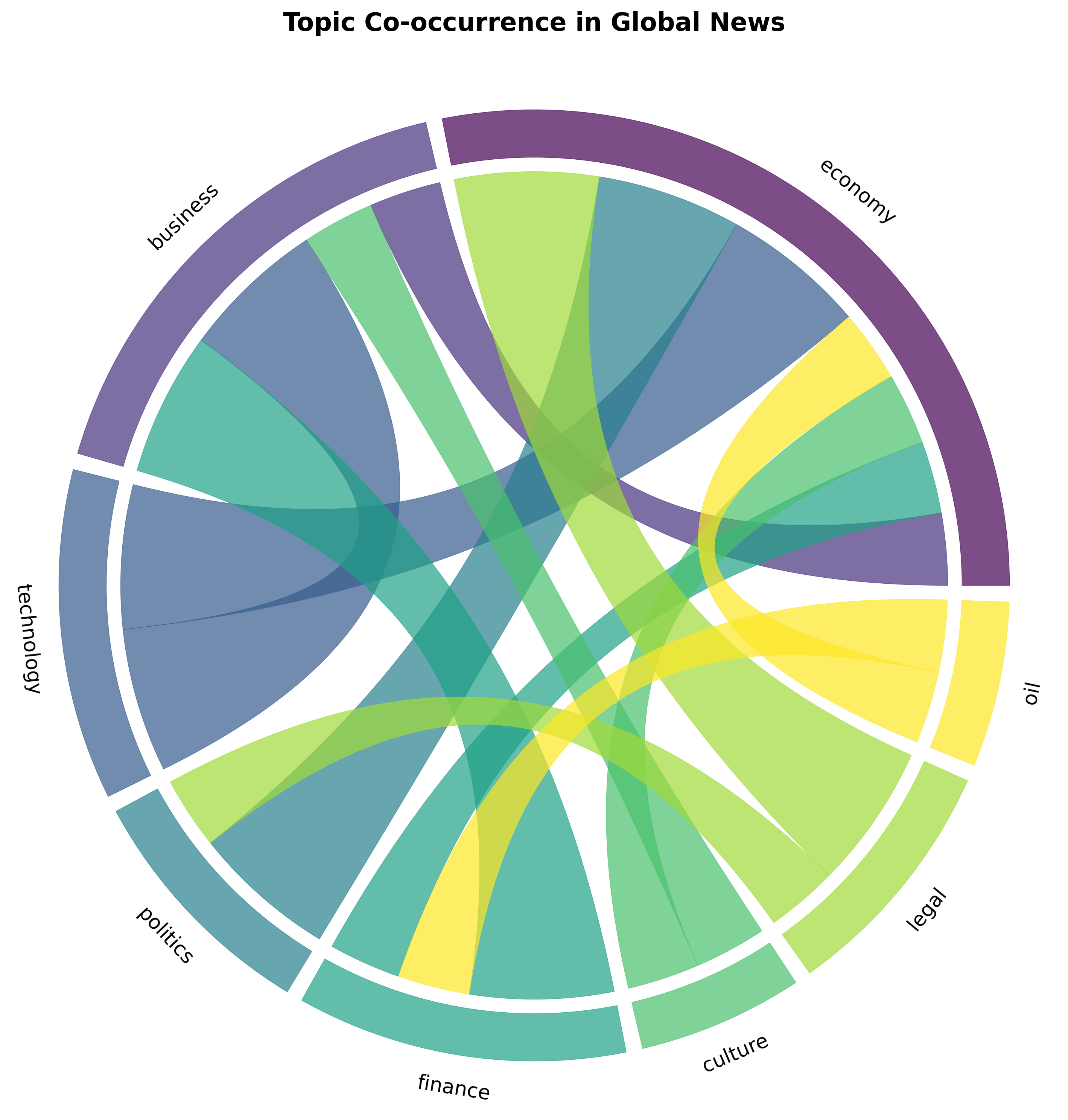
Step 4: Create and Style the Chord Diagram
Section titled “Step 4: Create and Style the Chord Diagram”Now we’ll create the chord diagram with professional styling using matplotlib.
# Create figurefig, ax = plt.subplots(figsize=(10, 10))
# Create chord diagramchord_diagram(matrix, names=top_topics, ax=ax)
# Style the visualizationax.set_title('Topic Co-occurrence in Global News',             fontsize=16, fontweight='bold', pad=20)
# Save the visualizationplt.tight_layout()plt.savefig('topic_cooccurrence_chord.png', dpi=300, bbox_inches='tight')
print("Chord diagram saved to 'topic_cooccurrence_chord.png'")
Understanding the Styling Options
Section titled “Understanding the Styling Options”Figure Setup:
figsize=(10, 10)— Square aspect ratio works best for chord diagrams- Creates matplotlib figure and axis objects for full control
Chord Diagram:
matrix— The co-occurrence data as a 2D arraynames=top_topics— Labels for each topic around the circleax=ax— Specifies which matplotlib axis to use
Styling:
set_title()— Adds title with custom font size and weightpad=20— Adds spacing between title and diagram
Output:
- Saves as high-resolution PNG (300 DPI)
bbox_inches='tight'— Removes excess whitespace- Perfect for reports, presentations, and publications
Working Within API Limits
Section titled “Working Within API Limits”With 100 calls per day on the free tier, you can:
- Run this analysis daily to track how topic relationships evolve
- Experiment with different time periods using date filters
- Build a time-series dataset by saving results daily
Cache Your API Responses
Section titled “Cache Your API Responses”Avoid repeated calls during development by caching data:
import json
# Save response after fetchingwith open('news_data.json', 'w') as f:    json.dump(articles, f)
# Load cached data in subsequent runswith open('news_data.json', 'r') as f:    articles = json.load(f)
Benefits:
- Iterate faster — Tweak visualizations without making new API calls
- Preserve quota — Save API calls for fresh data collection
- Reproducibility — Analyze the same dataset across sessions
Plan Your Data Collection
Section titled “Plan Your Data Collection”- Daily analysis — Fetch 100 articles/day for tracking relationship evolution
- Weekly deep dives — Accumulate 700 articles over a week for robust patterns
- Upgrade when needed — Visit newsdatahub.com/plans for higher limits
Alternative Visualization Libraries
Section titled “Alternative Visualization Libraries”While mpl_chord_diagram is simple and effective, you might explore:
pyCirclize
Section titled “pyCirclize”from pycirclize import Circos
# More advanced circular visualizations# Highly customizable# Supports multiple tracks and layersNetworkX with Circular Layout
Section titled “NetworkX with Circular Layout”import networkx as nximport matplotlib.pyplot as plt
# Full control over network visualizations# Can create custom circular layouts# Good for complex network analysis- What types of data work best with chord diagrams?
Chord diagrams excel with categorical many-to-many relationships: topic co-occurrence, user journey flows, trade between countries, migration patterns, collaboration networks. They’re not suitable for hierarchical data, simple comparisons, or time series.
- How many categories can I include before it becomes cluttered?
The sweet spot is 6-12 categories. Below 5 doesn’t show enough complexity. Above 15 becomes difficult to read. Adjust based on your specific data and audience.
- Can I make chord diagrams with other tools?
Yes. Popular alternatives include HoloViews, Plotly, D3.js (JavaScript), Circos, pyCirclize, and custom implementations with NetworkX + Matplotlib. mpl_chord_diagram is chosen here for its simplicity and ease of use with Matplotlib.
- Why use mpl_chord_diagram instead of pure Matplotlib?
mpl_chord_diagram provides built-in chord diagram support with minimal code. Pure Matplotlib would require significant custom code to create circular layouts, arcs, and ribbons. mpl_chord_diagram handles the complex geometry while giving you full Matplotlib styling control.
- Can I analyze more than 100 articles?
Yes. Use cursor-based pagination to fetch multiple pages:
articles = []cursor = Noneheaders = {    "x-api-key": "YOUR_API_KEY",    "User-Agent": "chord-diagram-topic-cooccurrence/1.0-py"}for _ in range(3):  # Fetch 3 pages (300 articles)    params = {"per_page": 100}    if cursor:        params["cursor"] = cursor
    response = requests.get(url, headers=headers, params=params)    data = response.json()    articles.extend(data.get("data", []))    cursor = data.get("next_cursor")    if not cursor:        break
See How Does Cursor Pagination Work in NewsDataHub API for details.
- What if my API key doesn’t work?
Verify:
- Key is correct (check your dashboard)
- Header name is
x-api-key(lowercase, with hyphens) - You haven’t exceeded rate limits
- Network/firewall isn’t blocking API requests
- How do I filter for specific topics?
Add topic filter to API request:
params = { "per_page": 100, "topic": "technology,business" # Only fetch these topics}- How fresh is the data?
NewsDataHub updates continuously. The free tier provides recent articles. For specific time ranges, use from_date and to_date parameters. Visit newsdatahub.com/plans for tier-specific freshness guarantees.