
How to Create Sankey Diagrams to Visualize News Source-to-Topic Flows in Python
Quick Answer: This tutorial teaches you how to create beautiful static Sankey diagrams in Python using Plotly to visualize how different news sources distribute their coverage across topics. You’ll learn to transform real news data from NewsDataHub API into publication-ready PNG visualizations.
Perfect for: Python developers, data journalists, media analysts, and anyone building news analytics dashboards or studying information flow patterns in media.
Time to complete: 20-25 minutes
Difficulty: Beginner
Stack: Python, Plotly, NewsDataHub API
What You’ll Build
Section titled “What You’ll Build”You’ll create a professional Sankey diagram that reveals:
- Source-to-topic flows — Visualize how each news outlet distributes coverage across different topics
- Coverage patterns — Identify which sources specialize in specific topics vs. those with diverse coverage
- Flow magnitudes — See at a glance which source-topic combinations produce the most articles
- Publication-ready output — Export as high-resolution PNG for reports and presentations
By the end, you’ll understand when to use Sankey diagrams instead of bar charts, how to structure flow data, and best practices for creating professional flow visualizations.
Prerequisites
Section titled “Prerequisites”Required Tools
Section titled “Required Tools”- Python 3.7+
- pip package manager
Install Required Packages
Section titled “Install Required Packages”pip install requests pandas plotly kaleidoNote: kaleido is required for exporting static PNG images.
API Key
Section titled “API Key”- NewsDataHub API key — Get free key
For current API quotas and rate limits, visit newsdatahub.com/plans.
Knowledge Prerequisites
Section titled “Knowledge Prerequisites”- Basic Python syntax
- Familiarity with lists and dictionaries
- Understanding of loops and functions
Understanding Sankey Diagrams: When and Why
Section titled “Understanding Sankey Diagrams: When and Why”What Are Sankey Diagrams?
Section titled “What Are Sankey Diagrams?”A Sankey diagram is a flow visualization where arrow or path width represents flow magnitude. Unlike bar charts that show simple counts, Sankey diagrams reveal relationships between categories.
Key characteristics:
- Directional flows — Show movement from source nodes to target nodes
- Proportional width — Thicker flows indicate higher volume
- Multi-level connections — One source can flow to multiple targets
- Visual hierarchy — Easy to spot dominant vs. minor pathways
When to Use Sankey vs. Bar Charts
Section titled “When to Use Sankey vs. Bar Charts”Choose visualization types based on your question:
| Question Type | Best Visualization | Example |
|---|---|---|
| ”How many articles per topic?” | Bar Chart | Simple counts |
| ”Which sources cover which topics?” | Sankey Diagram | Relationships |
| ”What’s the distribution by country?” | Bar Chart | Single dimension |
| ”How do sources flow to topics to countries?” | Sankey Diagram | Multi-level flows |
Use Sankey diagrams when you need to:
- Visualize how quantities flow from one category to another
- Show distribution of resources, content, or measurable items
- Identify major pathways and relationships between categories
- Display multi-step processes or hierarchical relationships
- Reveal patterns in how sources connect to destinations
Use bar charts when you need to:
- Compare simple quantities across categories
- Show rankings (top 10 sources, most popular topics)
- Display single-dimensional data
- Create straightforward comparisons
Data Structure: Sankey vs. Bar Charts
Section titled “Data Structure: Sankey vs. Bar Charts”Bar chart data structure:
# Simple category-count pairs{"Technology": 50, "Politics": 75, "Sports": 30}Sankey diagram data structure:
# Source-Target-Value triplets[ {"source": "CNN", "target": "Technology", "value": 15}, {"source": "CNN", "target": "Politics", "value": 30}, {"source": "BBC", "target": "Technology", "value": 20}]The key difference: Sankey diagrams require relationship data with three components (source, target, value), not just counts.
How to Interpret Sankey Diagrams
Section titled “How to Interpret Sankey Diagrams”When reading a Sankey diagram:
- Thicker flows = higher volumes — Wide paths represent more items flowing from source to target
- Follow the paths — Trace flows from left (sources) to right (targets)
- Compare flows — See which source-target combinations are strongest
- Spot patterns — Identify sources that specialize in certain topics vs. those with diverse coverage
- Look for anomalies — Unusually thick or thin flows may reveal interesting insights
Step 1: Fetch News Data
Section titled “Step 1: Fetch News Data”We’ll retrieve news articles to analyze. You have two options:
-
With an API key: The script fetches live data from NewsDataHub.
-
Without an API key: The script downloads a sample dataset from GitHub, so you can follow along without signing up.
Fetch Articles with API
Section titled “Fetch Articles with API”import requestsimport plotly.graph_objects as gofrom collections import defaultdict, Counterimport jsonimport os
# Set your API key here (or leave empty to use sample data)API_KEY = "" # Replace with your NewsDataHub API key, or leave empty
# Check if API key is providedif API_KEY and API_KEY != "your_api_key_here": print("Using live API data...")
url = "https://api.newsdatahub.com/v1/news?language=en" headers = { "x-api-key": API_KEY, "User-Agent": "sankey-diagram-news-sources-to-topic-flows/1.0-py" } params = {"per_page": 100}
# Fetch articles response = requests.get(url, headers=headers, params=params) response.raise_for_status() articles = response.json().get("data", []) print(f"Fetched {len(articles)} articles from API")
else: print("No API key provided. Loading sample data...")
# Download sample data if not already present sample_file = "sample-news-data.json"
if not os.path.exists(sample_file): print("Downloading sample data...") sample_url = "https://raw.githubusercontent.com/newsdatahub/newsdatahub-data-science-tutorials/main/tutorials/bar-charts-news-data/data/sample-news-data.json" response = requests.get(sample_url) with open(sample_file, "w") as f: json.dump(response.json(), f) print(f"Sample data saved to {sample_file}")
# Load sample data with open(sample_file, "r") as f: data = json.load(f)
# Handle both formats: raw array or API response with 'data' key if isinstance(data, dict) and "data" in data: articles = data["data"] elif isinstance(data, list): articles = data else: raise ValueError("Unexpected sample data format")
print(f"Loaded {len(articles)} articles from sample data")Expected output (with API key):
Using live API data...Fetched 100 articles from APIExpected output (without API key):
No API key provided. Loading sample data...Downloading sample data...Sample data saved to sample-news-data.jsonLoaded 100 articles from sample dataUnderstanding the code:
- Dual mode — Works with live API or sample data, making it easy to test without an API key
- Sample data fallback — Automatically downloads sample data if no key is provided
raise_for_status()— Throws error for 4XX/5XX HTTP responses- Format flexibility — Handles both raw arrays and API response objects
Step 2: Extract Source-to-Topic Relationships
Section titled “Step 2: Extract Source-to-Topic Relationships”Now we’ll process the articles to identify how sources map to topics.
Count Source-Topic Pairs
Section titled “Count Source-Topic Pairs”# Extract source and topic informationflows = defaultdict(int)
for article in articles: # Extract source name - check both top-level and nested source fields source_name = article.get("source_title")
# Extract topics (handle arrays) article_topics = article.get("topics", [])
# Count each source-topic pair if source_name and article_topics: if isinstance(article_topics, list): for topic in article_topics: if topic and topic != "general": flows[(source_name, topic)] += 1
# Convert to list formatflow_data = [ {"source": src, "target": tgt, "value": val} for (src, tgt), val in flows.items()]
print(f"Found {len(flow_data)} source-topic combinations")What this does:
defaultdict(int)— Automatically initializes counters at 0, avoiding KeyError- Handles nested data — Checks
source_titleat top level first, then falls back to nestedsourceobject - Processes topic arrays — NewsDataHub returns topics as arrays, so we iterate through them
- Filters “general” — Excludes placeholder topic for uncategorized articles
- Creates flow counts — Each (source, topic) pair gets a count representing article volume
Why use tuples as keys:
(source_name, topic)creates hashable key for dictionary- Enables counting unique combinations efficiently
- Easy to convert to list of dictionaries later
Convert to List Format
Section titled “Convert to List Format”# Convert to list of dictionaries for easier processingflow_data = [ {"source": src, "target": tgt, "value": val} for (src, tgt), val in flows.items()]
# Preview first few flowsprint("Sample flows:")for item in flow_data[:5]: print(f" {item['source']} → {item['target']}: {item['value']} articles")Expected output:
Sample flows: CNN → Politics: 12 articles CNN → Technology: 8 articles BBC → World News: 15 articles Reuters → Business: 10 articles The Guardian → Environment: 7 articlesThis list comprehension transforms the dictionary into the source-target-value structure required by Plotly.
Step 3: Filter to Top Sources for Clarity
Section titled “Step 3: Filter to Top Sources for Clarity”Sankey diagrams with too many nodes become cluttered. Let’s filter to the most active sources.
Identify Top Sources
Section titled “Identify Top Sources”from collections import Counter
# Count total articles per sourcesource_counts = Counter()for item in flow_data: source_counts[item["source"]] += item["value"]
# Get top 10 sources by article counttop_sources = [source for source, _ in source_counts.most_common(10)]
print(f"Top 10 sources: {', '.join(top_sources[:5])}...")Expected output:
Top 10 sources: CNN, BBC, Reuters, The Guardian, Associated Press...Filter Flow Data
Section titled “Filter Flow Data”# Keep only flows from top sourcesflow_data = [ item for item in flow_data if item["source"] in top_sources]
print(f"Filtered to {len(flow_data)} flows from top 10 sources")Expected output:
Filtered to 38 flows from top 10 sourcesWhy filter to top sources:
- Visual clarity — 10 source nodes create readable diagram without clutter
- Focus on major patterns — Top sources represent bulk of coverage
- Performance — Fewer nodes render faster and respond better to interaction
- Storytelling — Easier to identify dominant source-topic relationships
Alternative filtering strategies:
# Filter by minimum flow size (show only flows with 5+ articles)flow_data = [item for item in flow_data if item["value"] >= 5]
# Filter to specific topicstarget_topics = ["Technology", "Politics", "Business"]flow_data = [item for item in flow_data if item["target"] in target_topics]
# Combine filtersflow_data = [    item for item in flow_data    if item["source"] in top_sources and item["value"] >= 3]
Step 4: Prepare Data for Plotly Sankey
Section titled “Step 4: Prepare Data for Plotly Sankey”Plotly requires numeric indices, not string names. We’ll create mappings.
Create Node Lists and Mappings
Section titled “Create Node Lists and Mappings”# Create lists of unique sources and topicssources_list = sorted(set(item["source"] for item in flow_data))topics_list = sorted(set(item["target"] for item in flow_data))
print(f"Sources: {len(sources_list)}, Topics: {len(topics_list)}")
# Create combined node list (sources first, then topics)all_nodes = sources_list + topics_list
# Create mapping from names to indicesnode_dict = {node: idx for idx, node in enumerate(all_nodes)}
print(f"Total nodes: {len(all_nodes)}")Expected output:
Sources: 10, Topics: 12Total nodes: 22Why this structure:
- Plotly requirement — Sankey diagrams need numeric indices, not string labels
- Sources first — Placing sources before topics in list ensures left-to-right layout
- Alphabetical sorting — Creates consistent ordering for reproducibility
- Dictionary mapping — Fast O(1) lookup when converting names to indices
Convert to Index-Based Format
Section titled “Convert to Index-Based Format”# Prepare three parallel lists for Plotlysource_indices = [node_dict[item["source"]] for item in flow_data]target_indices = [node_dict[item["target"]] for item in flow_data]values = [item["value"] for item in flow_data]
print(f"Created {len(values)} flows")Expected output:
Created 38 flowsUnderstanding parallel lists:
- source_indices — Numeric ID of each flow’s starting node
- target_indices — Numeric ID of each flow’s ending node
- values — Magnitude of each flow (article count)
- Same length — All three lists must have identical length for Plotly
Example visualization of the transformation:
# Before (string-based){"source": "CNN", "target": "Politics", "value": 12}
# After (index-based, assuming CNN is index 0, Politics is index 10)source_indices = [0]target_indices = [10]values = [12]
Step 5: Create Sankey Diagram with Bright Colors
Section titled “Step 5: Create Sankey Diagram with Bright Colors”Now for the visualization magic with Plotly.
Define Professional Color Scheme
Section titled “Define Professional Color Scheme”# Bright, vivid color palette for sourcessource_colors = [ '#FF1744', # Bright Red '#2979FF', # Bright Blue '#00E676', # Bright Green '#FF9100', # Bright Orange '#D500F9', # Bright Purple '#FF4081', # Bright Pink '#00E5FF', # Bright Cyan '#FFEA00', # Bright Yellow '#651FFF', # Bright Indigo '#FF6E40', # Bright Deep Orange]
# Bright, saturated color palette for topicstopic_colors = [ '#FF5252', # Bright Light Red '#448AFF', # Bright Light Blue '#69F0AE', # Bright Light Green '#FFD740', # Bright Light Yellow '#E040FB', # Bright Light Purple '#FF80AB', # Bright Light Pink '#18FFFF', # Bright Light Cyan '#FFAB40', # Bright Light Orange]
# Assign colors: sources get vibrant colors, topics get bright colorsnode_colors = []for node in all_nodes: if node in sources_list: idx = sources_list.index(node) node_colors.append(source_colors[idx % len(source_colors)]) else: # Topic node - use topic colors idx = topics_list.index(node) node_colors.append(topic_colors[idx % len(topic_colors)])
print(f"Assigned colors to {len(node_colors)} nodes")Color strategy rationale:
- Bright source colors — Vivid colors help users track individual sources across the diagram
- Bright topic colors — Colorful topics make the visualization more engaging and readable
- Modulo operator — Cycles through colors if more sources/topics than colors
- High contrast — Vibrant palette ensures excellent readability
Build the Sankey Diagram
Section titled “Build the Sankey Diagram”# Create colored flows that inherit from source colorslink_colors = []for src_idx in source_indices: source_color = node_colors[src_idx] # Convert hex to rgba with 50% opacity if source_color.startswith('#'): r = int(source_color[1:3], 16) g = int(source_color[3:5], 16) b = int(source_color[5:7], 16) link_colors.append(f'rgba({r}, {g}, {b}, 0.5)') else: link_colors.append('rgba(200, 200, 200, 0.5)')
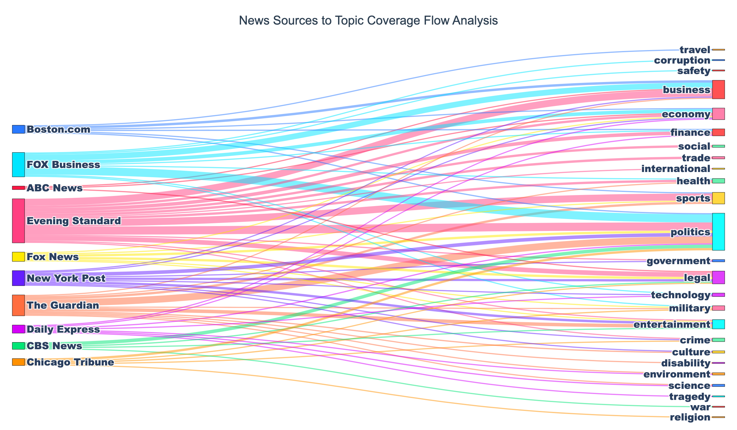
# Create Sankey diagramfig = go.Figure(data=[go.Sankey( node=dict( pad=15, # Vertical space between nodes thickness=20, # Node width in pixels line=dict( color="black", # Node border color width=0.5 # Node border width ), label=all_nodes, # Node text labels color=node_colors # Node fill colors ), link=dict( source=source_indices, # Starting node indices target=target_indices, # Ending node indices value=values, # Flow magnitudes color=link_colors # Colored flows matching sources ))])
print("Sankey diagram created")Parameter explanations:
pad=15— Prevents nodes from touching vertically for readabilitythickness=20— Balances node visibility without dominating the chartlineproperties — Adds definition with thin black borderslabel=all_nodes— Shows source/topic names on nodes- Semi-transparent links — Allows seeing overlapping flows
Style the Layout
Section titled “Style the Layout”# Add professional stylingfig.update_layout( title={ 'text': "News Sources to Topic Coverage Flow Analysis", 'font': {'size': 20, 'family': 'Arial, sans-serif', 'color': '#2C3E50'}, 'x': 0.5, # Center title 'xanchor': 'center' }, font=dict(size=16, family='Arial Black, sans-serif'), plot_bgcolor='white', paper_bgcolor='white', height=700, margin=dict(l=20, r=20, t=80, b=20))
print("Layout styled")Styling decisions:
- Centered title — Professional appearance with
x=0.5andxanchor='center' - White background — Clean, presentation-ready aesthetic
- Height=700 — Sufficient vertical space for multiple flows without overlap
- Adequate margins — Prevents label cutoff at edges
Save as Static Image
Section titled “Save as Static Image”# Save as PNG image (high-resolution)fig.write_image('news_source_topic_sankey.png', width=1200, height=700, scale=2)print("✓ Sankey diagram saved to news_source_topic_sankey.png")Output format:
- PNG file — High-resolution raster image (1200x700, 2x scale) perfect for reports, presentations, and publications
- Retina-ready — The
scale=2parameter doubles the resolution for crisp display on high-DPI screens
Step 6: Add Advanced Styling
Section titled “Step 6: Add Advanced Styling”Enhance your Sankey diagram with custom labels and color-coded flows.
Understanding the Visualization Elements
Section titled “Understanding the Visualization Elements”The code above creates a complete, production-ready Sankey diagram with:
Custom hover labels — When you hover over flows, you’ll see “Source → Topic: N articles” format
Color-coded flows — Flows inherit colors from their source nodes (with 50% transparency), making it easy to trace which source feeds which topics
Bold text labels — Using Arial Black at size 16 makes source and topic names highly readable
Professional styling — White background, centered title, and proper margins create a publication-ready aesthetic
Customization Options
Section titled “Customization Options”Want to adjust the visualization? Here are common modifications:
Adjust flow transparency:
# Change opacity in link_colors looplink_colors.append(f'rgba({r}, {g}, {b}, 0.7)') # 70% opacity instead of 50%Change font size:
font=dict(size=18, family='Arial Black, sans-serif') # Larger textAdjust diagram dimensions:
fig.write_image('news_source_topic_sankey.png', width=1600, height=900, scale=2) # Larger imageBest Practices for Professional Sankey Diagrams
Section titled “Best Practices for Professional Sankey Diagrams”1. Limit Node Count
Section titled “1. Limit Node Count”Keep diagrams readable by filtering nodes:
# Top N sources by volumetop_n = 10top_sources = [s for s, _ in source_counts.most_common(top_n)]
# Minimum flow thresholdmin_articles = 5flow_data = [item for item in flow_data if item["value"] >= min_articles]
# Combine filters for best resultsflow_data = [    item for item in flow_data    if item["source"] in top_sources and item["value"] >= min_articles]
Guidelines:
- 5-15 source nodes — Ideal range for clarity
- 5-20 target nodes — More targets acceptable since they’re on the right
- Total nodes < 30 — Beyond this, consider splitting into multiple diagrams
2. Sort Nodes Strategically
Section titled “2. Sort Nodes Strategically”Control node ordering for visual appeal:
# Sort sources by total volume (most active at top)# Use the existing source_counts Counter object for efficiencysources_list = [s for s, _ in source_counts.most_common()]
# Sort topics alphabetically for consistencytopics_list = sorted(topics_list)
3. Add Context with Annotations
Section titled “3. Add Context with Annotations”# Add explanatory textfig.add_annotation( text="Node size indicates total articles; flow width shows source-topic volume", xref="paper", yref="paper", x=0.5, y=-0.05, showarrow=False, font=dict(size=11, color='gray'))4. Export for Different Use Cases
Section titled “4. Export for Different Use Cases”# High-resolution PNG for reports/presentationsfig.write_image('sankey_diagram.png', width=1200, height=700, scale=2)5. Handle Edge Cases
Section titled “5. Handle Edge Cases”# What if no data?if not flow_data: print("No source-topic relationships found. Try different filters.") exit()
# What if only one source?if len(sources_list) < 2: print("Need at least 2 sources for meaningful Sankey. Use bar chart instead.") exit()
# What if too many flows?if len(flow_data) > 100: print(f"Warning: {len(flow_data)} flows may clutter diagram. Consider filtering.")Working Within API Rate Limits
Section titled “Working Within API Rate Limits”NewsDataHub free tier offers 100 API calls per day. Here’s how to maximize your usage:
Cache Data During Development
Section titled “Cache Data During Development”import json
# Save fetched data to diskwith open("cached_news.json", "w") as f: json.dump(articles, f, indent=2)
# Load from cache instead of making API callswith open("cached_news.json", "r") as f: articles = json.load(f)Benefits:
- Iterate faster — No waiting for API responses during chart tweaking
- Preserve quota — Save API calls for fresh data collection
- Reproducibility — Analyze the same dataset across sessions
Maximize each request
Section titled “Maximize each request”Use the per_page query parameter to fetch up to 100 articles per call (available on all tiers, including free). Two well-structured requests can give you 200 articles for analysis.
Track Your Usage
Section titled “Track Your Usage”import datetime
# Log each API calldef fetch_with_logging(url, headers, params): response = requests.get(url, headers=headers, params=params) print(f"[{datetime.datetime.now()}] API call made. Status: {response.status_code}") return response
# Count calls per sessionapi_calls = 0for _ in range(2): response = fetch_with_logging(url, headers, params) api_calls += 1print(f"Total API calls this session: {api_calls}")Plan Your Data Collection
Section titled “Plan Your Data Collection”- Daily analysis — Fetch 100 articles/day for time-series tracking
- Weekly deep dives — Accumulate 700 articles over a week
- Upgrade when needed — Visit newsdatahub.com/plans for higher limits
- When should I use a Sankey diagram instead of a bar chart?
Use Sankey diagrams when you need to show relationships and flows between categories, not just counts. Bar charts answer “how many?”, Sankey diagrams answer “how does X flow to Y?” Choose Sankey when you have source-target data with meaningful connections.
- Can I create multi-level Sankey diagrams?
Yes! Plotly supports multi-level flows. For example, Source → Topic → Country requires all nodes in one list and two sets of links (source-to-topic and topic-to-country). The key is ensuring target indices from the first level match source indices in the second level.
- How do I handle too many flows?
Filter aggressively: (1) Limit to top N sources, (2) Set minimum flow thresholds (e.g., >= 5 articles), (3) Focus on specific topics of interest, or (4) Create multiple diagrams for different subsets of your data.
- Why do I need to convert names to indices?
Plotly’s Sankey implementation requires numeric indices for performance and rendering. The library uses indices to calculate node positions, flow paths, and interactions. String labels are for display only.
- Why are my node colors not showing?
Ensure node_colors list has the same length as all_nodes. Also verify color format (use hex like #FF0000 or rgba like rgba(255, 0, 0, 1)). Check for None values in your color list.
- What if my API key doesn’t work?
Verify:
- Key is correct (check your dashboard)
- Header name is
x-api-key(lowercase, with hyphens) - You haven’t exceeded rate limits
- Network/firewall isn’t blocking API requests
- Can I filter for specific countries or date ranges?
Yes! Add parameters to your API request:
params = { "per_page": 100, "country": "US", "from_date": "2025-11-01", "to_date": "2025-11-30"}See NewsDataHub Search & Filtering Guide for all available filters.