
Data Visualization Cheat Sheet — Chart Types & Use Cases for News Data
This cheat sheet helps you choose the right visualization for your news data analysis. Each chart type includes a complete tutorial with working code, real examples, and NewsDataHub API integration.
Quick Selection Guide
Section titled “Quick Selection Guide”| Question | Recommended Chart | Tutorial Link |
|---|---|---|
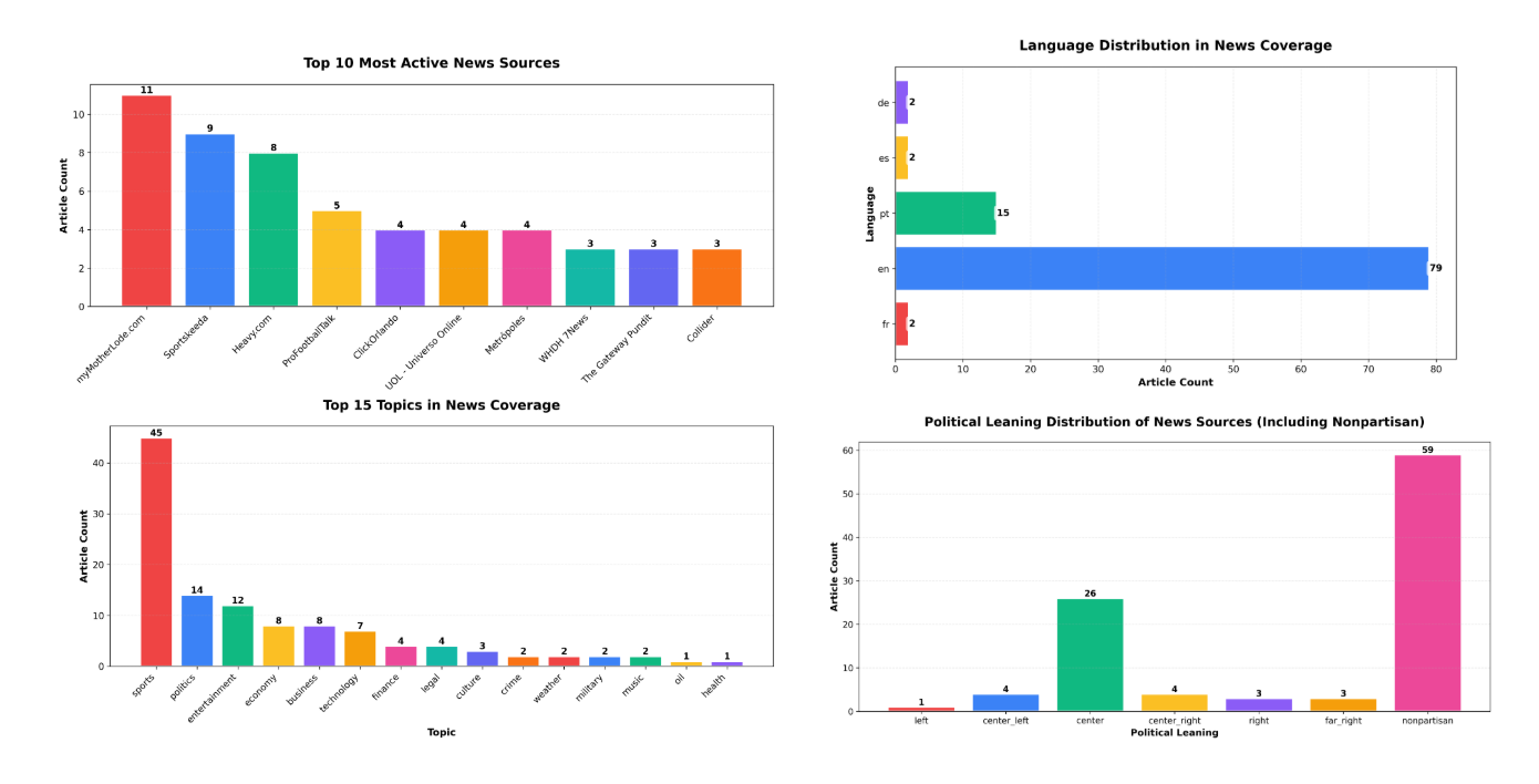
| ”How many articles per topic/source/country?” | Bar chart | Bar Charts Tutorial |
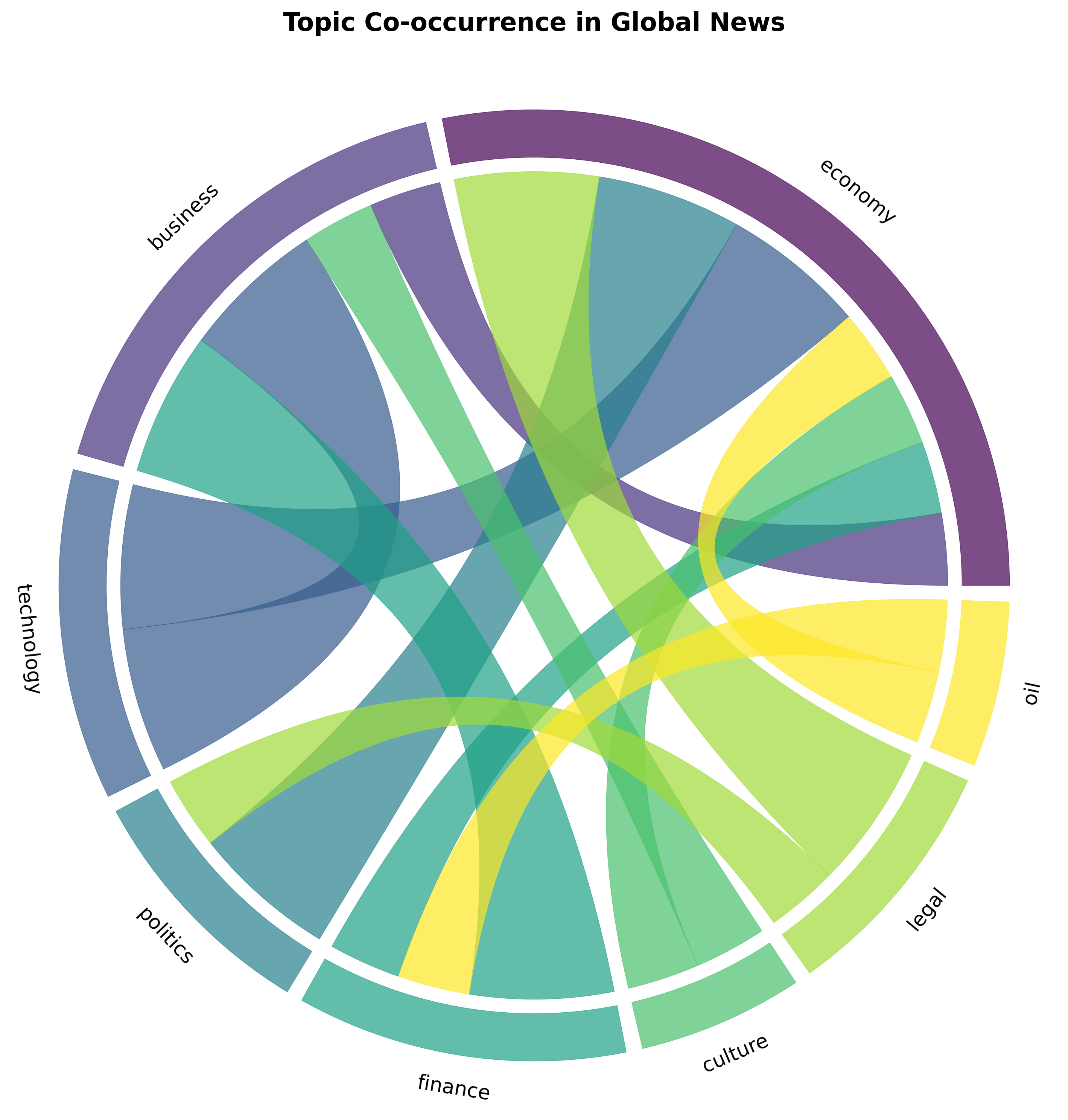
| ”Which topics co-occur together in articles?” | Chord diagram | Chord Diagram Tutorial |
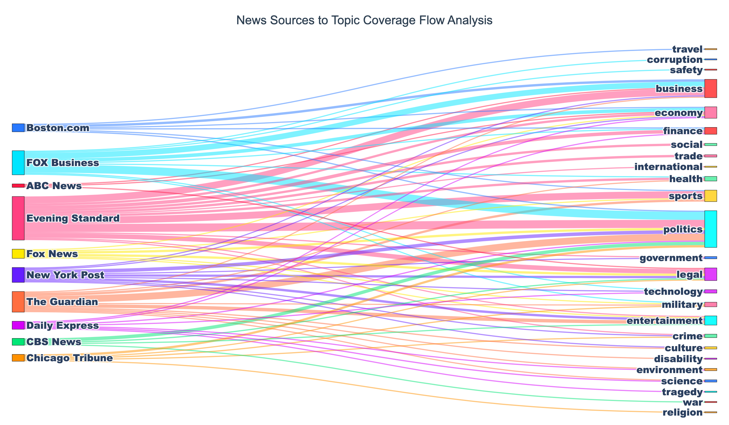
| ”How do sources distribute across topics?” | Sankey diagram | Sankey Diagram Tutorial |
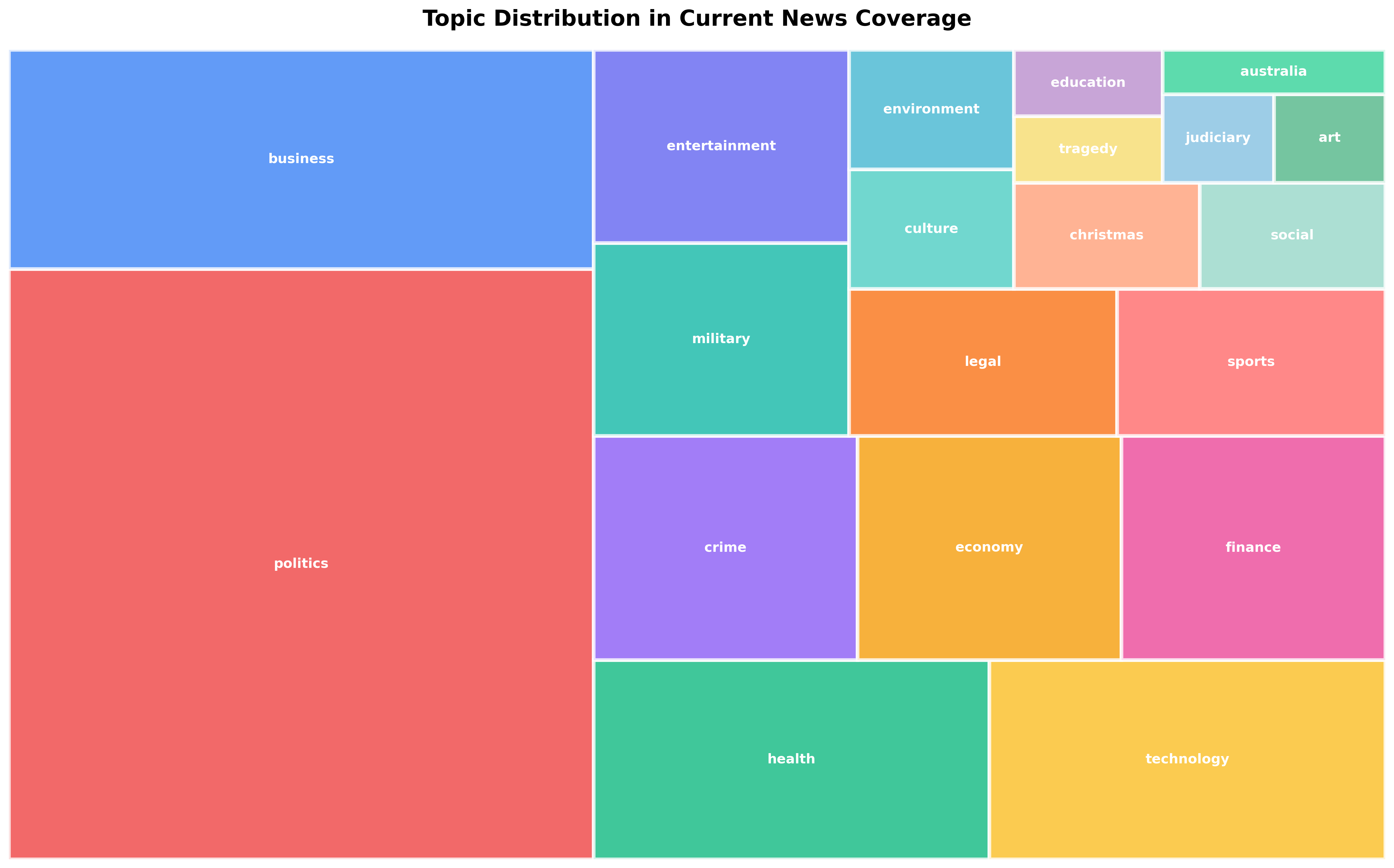
| ”Show hierarchical topic distribution” | Treemap | Treemap Tutorial |
Bar Charts
Section titled “Bar Charts”Description: Rectangular bars showing categorical data with bar length representing values.
Best for:
- Topic distributions (articles per topic)
- Source comparisons (most active publishers)
- Language breakdowns
- Country-wise article counts
- Political leaning distribution
- Comparing discrete categories with counts or frequencies
When to use:
- Comparing discrete categories
- Showing rankings or top-N lists
- Displaying counts or frequencies
- Data with 3-20 categories
- When exact values matter more than proportions
When NOT to use:
- Time series data (use line chart instead)
- Showing parts of a whole (use pie chart or treemap)
- Data with 50+ categories (overwhelms visualization)
- Continuous numerical distributions (use histogram)
NewsDataHub use cases:
- “Which topics had the most coverage this week?”
- “Top 10 most active news sources”
- “Article distribution by political leaning”
- “News coverage by country or language”
- “Compare article volume across source types”
Complete Tutorial: How to Create Bar Charts in Python Using Real News Data
Python libraries: matplotlib, seaborn, plotly
Quick example:
First, install matplotlib if you haven’t already:
pip install matplotlibimport requestsimport matplotlib.pyplot as pltfrom collections import Counter
# Fetch news from NewsDataHub APIresponse = requests.get( 'https://api.newsdatahub.com/v1/news', headers={ 'X-API-Key': 'YOUR_API_KEY', 'User-Agent': 'data-visualization-cheat-sheet/1.0-py' }, params={'per_page': 100, 'topic': 'technology'})
data = response.json()
# Count articles by topictopics = [topic for article in data['data'] for topic in article.get('topics', [])]topic_counts = Counter(topics).most_common(10)
# Create bar chartplt.figure(figsize=(12, 6))plt.bar([t[0] for t in topic_counts], [t[1] for t in topic_counts])plt.xlabel('Topic')plt.ylabel('Article Count')plt.title('Top 10 Topics by Article Count')plt.xticks(rotation=45, ha='right')plt.tight_layout()plt.show()Chord Diagrams
Section titled “Chord Diagrams”Description: Circular diagram showing relationships between entities with connecting ribbons. Ribbon thickness represents connection strength.
Best for:
- Topic co-occurrence (which topics appear together in articles)
- Keyword connections and relationships
- Source-to-topic relationships
- Cross-references between categories
- Many-to-many relationships with flow/connection strength
When to use:
- Showing many-to-many relationships
- Symmetric connections between entities
- Highlighting strongest connections
- Compact visualization of network data
- When you want to emphasize interconnections over individual nodes
When NOT to use:
- One-to-many or hierarchical relationships (use Sankey or treemap)
- When exact numerical values are critical
- Very sparse networks with few connections
- Asymmetric flows (use Sankey diagram instead)
NewsDataHub use cases:
- “Which topics frequently appear together in the same articles?”
- “Keyword co-occurrence patterns in headlines”
- “How topics relate to each other in news coverage”
- “What topics are discussed alongside ‘technology’?”
Complete Tutorial: Chord Diagram for Topic Co-occurrence
Python libraries: holoviews, plotly (custom implementation)
What you’ll learn in the tutorial:
- Fetching articles with multiple topics from NewsDataHub API
- Building co-occurrence matrices from topic data
- Creating interactive chord diagrams with HoloViews
- Interpreting connection patterns in news coverage
- Customizing colors and labels for clarity
Sankey Diagrams
Section titled “Sankey Diagrams”Description: Flow diagram showing how data moves between categories. Flow width represents volume.
Best for:
- News flow from sources to topics
- Source type → topic distribution
- Topic → sentiment distribution
- Article journey through categorization stages
- Multi-stage categorical flows with volume
When to use:
- Showing flow or transformation between stages
- Multi-stage categorical data with directionality
- Proportions that move between states
- Illustrating connections AND their relative magnitudes
- When you need to show both direction and volume
When NOT to use:
- Symmetric relationships (use chord diagram)
- Simple hierarchies (use treemap)
- Cyclical flows (Sankey is best for acyclic flows)
NewsDataHub use cases:
- “How do different sources distribute their coverage across topics?”
- “Flow from source political leaning → topics covered”
- “Article sentiment distribution by source type”
- “News coverage flow: source type → topic → sentiment”
Complete Tutorial: Sankey Diagram: News Sources to Topic Flows
Python libraries: plotly
What you’ll learn in the tutorial:
- Aggregating NewsDataHub API data for flow analysis
- Constructing source → topic relationships
- Building Sankey diagrams with Plotly
- Color-coding flows for better readability
- Interactive exploration of news coverage patterns
Treemaps
Section titled “Treemaps”Description: Nested rectangles where size represents hierarchical data. Larger rectangles contain smaller rectangles representing subcategories.
Best for:
- Topic distribution with subtopics
- Hierarchical category breakdown
- Nested categories (e.g., region → country → city)
- Proportional hierarchical data
- Space-efficient visualization of many categories
When to use:
- Hierarchical categorical data
- Showing proportions within categories
- Multiple levels of grouping
- Many categories that need compact visualization
- When you want to see both hierarchy and size at a glance
When NOT to use:
- Flows between categories (use Sankey)
- Non-hierarchical relationships (use chord diagram or network graph)
- When precise numerical comparison is needed (use bar chart)
NewsDataHub use cases:
- “Topic distribution with subtopic breakdown”
- “Source type → specific sources → article counts”
- “Country → region → city news coverage”
- “Hierarchical view of topic taxonomy with article counts”
Complete Tutorial: Treemap Visualization for Topic Distribution
Python libraries: plotly, squarify + matplotlib
What you’ll learn in the tutorial:
- Fetching hierarchical data from NewsDataHub API
- Aggregating article counts by nested categories
- Creating interactive treemaps with Plotly
- Color schemes for hierarchical visualization
- Drill-down interactions for exploration
Choosing the Right Chart
Section titled “Choosing the Right Chart”Decision Flow
Section titled “Decision Flow”What are you trying to show?
├─ Comparing categories by count/frequency│ └─ Use: Bar Chart│ Tutorial: Bar Charts in Python Using Real News Data│├─ Which topics appear together?│ └─ Use: Chord Diagram│ Tutorial: Chord Diagram for Topic Co-occurrence│├─ Flow from one category to another│ └─ Use: Sankey Diagram│ Tutorial: Sankey Diagram: News Sources to Topic Flows│└─ Hierarchical proportions (e.g., topics → subtopics) └─ Use: Treemap Tutorial: Treemap Visualization for Topic DistributionChart Characteristics Comparison
Section titled “Chart Characteristics Comparison”| Chart Type | Shows | Direction | Best Dataset Size | Interactivity |
|---|---|---|---|---|
| Bar Chart | Categorical counts | None | 3-20 categories | Optional |
| Chord Diagram | Symmetric relationships | Bidirectional | 5-20 entities | Recommended |
| Sankey Diagram | Flows/transformations | Unidirectional | 3-30 nodes | Recommended |
| Treemap | Hierarchical proportions | Hierarchical | Unlimited (nested) | Recommended |
Best Practices for News Data Visualization
Section titled “Best Practices for News Data Visualization”General Guidelines
Section titled “General Guidelines”1. Choose simplicity over complexity
- Start with the simplest chart that answers the question
- Only add complexity when it reveals additional insight
- Bar charts often work better than fancy alternatives
2. Consider your audience
- Journalists/general public: Use familiar charts (bar, pie)
- Data analysts: Use specialized charts (Sankey, chord)
- Provide clear labels and legends for all audiences
3. Label clearly
- Always label axes with units
- Include data source (“Source: NewsDataHub API”)
- Add titles that describe the insight, not just the data
- Use annotations to highlight key findings
4. Use color purposefully
- Color should encode information, not just be decorative
- Use consistent color schemes (same topic = same color across visualizations)
- Ensure accessibility (colorblind-friendly palettes)
- Limit to 7-10 distinct colors maximum
5. Provide context
- Indicate sample size (e.g., “Based on 10,000 articles from Dec 1-15”)
- Show time period clearly
- Compare to benchmarks when meaningful
- Note data limitations (e.g., “48-hour delay for free tier”)
For News Data Specifically
Section titled “For News Data Specifically”1. Always include time context
- Specify date range clearly
- News is time-sensitive—always show when data was collected
- Compare equivalent time periods when showing trends
2. Normalize when comparing different time periods
- Use percentages or rates rather than absolute counts
- Account for different baseline volumes (e.g., weekend vs weekday)
3. Handle missing data explicitly
- Show “Unknown” or “Other” categories for incomplete data
- Note data quality issues in captions
- Don’t hide missing categories—they tell part of the story
4. Use consistent categorization
- Maintain same topic/source/country groupings across charts
- Use same color schemes throughout a report/dashboard
- Define categories clearly (what counts as “technology” news?)
5. Show source diversity
- When showing topic coverage, indicate number of sources
- Avoid over-representing prolific sources
- Consider weighting by source diversity, not just article count
Tools & Libraries Reference
Section titled “Tools & Libraries Reference”Python Libraries
Section titled “Python Libraries”For Bar Charts:
- matplotlib — Highly customizable, publication-quality
- seaborn — Statistical visualization with beautiful defaults
- plotly — Interactive charts with hover, zoom, export
For Chord Diagrams:
- holoviews — High-level declarative API, integrates with Bokeh
- plotly — Custom implementation possible with advanced features
For Sankey Diagrams:
- plotly — Best Python library for Sankey diagrams
- matplotlib — Limited Sankey support, use plotly instead
For Treemaps:
- plotly — Interactive treemaps with drill-down
- squarify + matplotlib — Static treemaps, good for PDFs/print
Installation
Section titled “Installation”# Install all recommended librariespip install matplotlib seaborn plotly holoviews squarify pandas requests
# For Jupyter notebookspip install jupyterJupyter Notebook Setup
Section titled “Jupyter Notebook Setup”# Standard imports for news data visualizationimport requestsimport pandas as pdimport matplotlib.pyplot as pltimport seaborn as snsimport plotly.graph_objects as goimport plotly.express as pxfrom collections import Counter
# Configure matplotlib%matplotlib inlineplt.rcParams['figure.figsize'] = (12, 6)plt.rcParams['font.size'] = 10
# Configure plotly for notebookimport plotly.io as piopio.renderers.default = 'notebook'NewsDataHub API Integration
Section titled “NewsDataHub API Integration”All visualizations in the tutorials use NewsDataHub API data. Key endpoints:
1. General News Endpoint
Section titled “1. General News Endpoint”import requests
response = requests.get( 'https://api.newsdatahub.com/v1/news', headers={ 'X-API-Key': 'YOUR_API_KEY', 'User-Agent': 'data-visualization-cheat-sheet/1.0-py' }, params={ 'per_page': 100, 'topic': 'technology', # Optional filter 'language': 'en' # Optional filter })
articles = response.json()['data']2. Extract Visualization Data
Section titled “2. Extract Visualization Data”For Bar Charts (topic counts):
topics = [topic for article in articles for topic in article.get('topics', [])]topic_counts = Counter(topics).most_common(10)For Chord Diagrams (topic co-occurrence):
from itertools import combinations
# Get all topic pairs that co-occur in same articlespairs = []for article in articles:    article_topics = article.get('topics', [])    if len(article_topics) >= 2:        pairs.extend(list(combinations(sorted(article_topics), 2)))
co_occurrence = Counter(pairs)
For Sankey Diagrams (source → topic):
flows = []for article in articles:    source = article.get('source_title', 'Unknown')    topics = article.get('topics', ['Unknown'])    for topic in topics:        flows.append((source, topic))
flow_counts = Counter(flows)
For Treemaps (hierarchical topics):
# Group by primary topic, then count subtopicshierarchy = {}for article in articles: topics = article.get('topics', []) if topics: primary = topics[0] if primary not in hierarchy: hierarchy[primary] = Counter() for subtopic in topics[1:]: hierarchy[primary][subtopic] += 1Complete Example Workflow
Section titled “Complete Example Workflow”Here’s a complete workflow from API to visualization:
import requestsimport matplotlib.pyplot as pltfrom collections import Counter
# Step 1: Fetch data from NewsDataHub APIresponse = requests.get(    'https://api.newsdatahub.com/v1/news',    headers={        'X-API-Key': 'YOUR_API_KEY',        'User-Agent': 'data-visualization-cheat-sheet/1.0-py'    },    params={        'language': 'en',        'per_page': 100    })
articles = response.json()['data']
print(f"Fetched {len(articles)} articles")
# Step 2: Extract topicstopics = []for article in articles:    topics.extend(article.get('topics', []))
# Step 3: Count and ranktopic_counts = Counter(topics).most_common(10)
# Step 4: Visualize with bar chartplt.figure(figsize=(12, 6))plt.bar(    [t[0] for t in topic_counts],    [t[1] for t in topic_counts],    color='steelblue')plt.xlabel('Topic', fontsize=12)plt.ylabel('Article Count', fontsize=12)plt.title('Top 10 Topics in Recent News Coverage', fontsize=14, fontweight='bold')plt.xticks(rotation=45, ha='right')plt.tight_layout()
# Add data source annotationplt.figtext(0.99, 0.01, 'Source: NewsDataHub API',            ha='right', fontsize=8, style='italic')
plt.show()
# Step 5: Print summaryprint("\nTop 10 Topics:")for topic, count in topic_counts:    print(f"{topic:20} {count:4} articles")
Next Steps
Section titled “Next Steps”Ready to create your first visualization?
-
Start with bar charts — Easiest to implement, most versatile → Bar Charts Tutorial
-
Explore relationships — Chord diagrams show topic connections → Chord Diagram Tutorial
-
Visualize flows — Sankey diagrams show how news moves between categories → Sankey Diagram Tutorial
-
Show hierarchies — Treemaps compactly display nested categories → Treemap Tutorial
Get your NewsDataHub API key:
- Free tier: 100 requests/day, no credit card required
- Sign up: newsdatahub.com/login
- Docs: newsdatahub.com/docs
This cheat sheet focuses on practical, proven chart types with complete working tutorials. Each visualization type has a dedicated guide with real code, NewsDataHub API integration, and example outputs.